Advanced droughts workflow#
Click ![]() to launch this workflow on MyBinder.
to launch this workflow on MyBinder.
Click to go to this workflow’s GitHub repository.
About droughts and droughts’ risks#
What is a drought?#
Simply stated, drought is ‘the extreme persistence of precipitation deficit over a specific region for a specific period of time’ \(^1\). Droughts are often classified into three main types different by their severity, impacts, and time scales:
Meteorological drought is often caused by short-term precipitation deficiency and its impacts highly depend on its timing. For example, lack of rain during the sprouting phase in rain-fed agriculture could lead to crop failure.
Agricultural drought is a medium-term phenomenon, characterized by reduced soil moisture content and is caused by a prolonged period of meterological drought.
On the long-term, hydrological drought is characterized by lower stream flow, reduced water level in water bodies, and may affect groundwater storage.
The cascade between drought types is goverened by the severity (i.e., magnitude), duration, and spatio-temporal distribution of drought events.
What is drought risk?#
Drought risk is a measure for quantifying the likelyhood of a meaningfull impact from drought-event(s) on human population, its economic activity and assets, and the environment. The risk for an impact depends on the drought hazard, exposure, and the vulnerability to droughts. Hazard measures the magnitude, duration, and timing of drougt events. Exposure to droughts represent the spatial distribution of drought relative to distribution of potentially impactful systems, e.g., location of cultivated land, wetlands, etc. Finally, vulnerability stands for the level of impact expected for a given system during a given event, and is affected by the systems’ intrinsic attributes. For example, fields with drought-resistent crops varities would be less vulnerable to droughts.
How do we assess drought risk?#
There are many different metrics to assess drought risk, which account for at least one of the risk factors: hazard, exposure and vulnerability.
This workflow quantifies drought risk as the product of drought hazard, exposure and vulnerability. The methodology used here was developed and applied globally by Carrão et al. (2016)\(^2\). The resulting risk map shows relative drought risk of different spatial units (i.e., NUTS2) out of a bigger region (i.e., European Union).
Following are the description of the data and tools used to calcualte drought hazard, exposure and vulnerability, the implementation to the EU, and visulization of the results via an interactive map of drought risk.
Quantifying drought hazard#
Hazard indicators Drought hazard (dH) for a given region is estimated as the probability of exceedance the median of regional (e.g., EU level) severe precipitation deficits for an historical reference period (1960 -2019). A severe precipitation deficity is calculated using the weighted anomaly of standardized precipitation (WASP) index. This index accounts for precipitation seasonal patterns and is computed by summing weighted and standardized monthly precipitation anomalies \(^3\).
use the weighted anomaly of standardized precipitation (WASP) index to define the severity of precipitation deficit. The WASP-index takes into account the annual seasonality of precipitation cycle and is computed by summing weighted standardized monthly precipitation anomalies (see (12)). Where \(P_{n,m}\) is each region’s monthly precipitation, \(T_m\) is a monthly treshold defining precipitation severity, and \(T_A\) is an annual threshold for precipitation severity.
The thresholds are defined by dividing multi-annual monthly observed rain using the ‘Fisher-jenks’ classigication algorithm \(^4\).
Hazard data and methods:#
This algorithm requires monthly total precipitation for each NUTS2 region during the historical reference period. Usually, these are observation-based or simulated time-series of gridded precipitation data. Processing these data is performed by applying Geographic Information System (GIS) techniques, to extract an aggregated value (e.g., total precipitation) of the data points located within each area of interest (e.g., NUTS2 region). Zonal statistics is widely used for that purpose.
Point, observation-based datasets are an alternative data source, usually collected by meteorological station networks. One can choose the data collected in one or more (e.g., average) representative station per area of interest to construct a NUTS2 level dataset. The algorithm expects a table in which each row represnt a month-year combination, and each column an area of interest. The first column represnts the date following this format YYYY-MM-DD. The title of the first columns has to be ‘timing’, and the rest of the titles has to be the codes of the areas of interest (e.g., NUTS2), which have to be identical to the codes as they appear in the NUTS2 spatial data from the European Commision.
Quantifying drought exposure#
Drought exposure (dE) indicates the potential losses from different types of drought disasters at different geographic regions. Quantyfing drought exposure utlizes a non-compensatory model to account for the spatial distribution of an potential imapct for crops and livestock, competition on water (e.g., for industrial uses represneted by the water stress indicator), and human direct need (e.g., for drinking represneted by population size). We apply a Data Envelopment Analysis (DEA) to determine the relative exposure of each region to drought.
Data Envelopment Analysis (DEA) \(^5\)
Data Envelopment Analysis (DEA) has been broadly used for evaluating the efficiency of decision-making units (DMUs) in many areas for organizational performance improvement, such as financial institutions, manufacturing companies, hospitals, airlines, and government agencies. In the same way DEA estimates relative efficiency of the decision-making units, DEA can also be be used to quantify the relative exposure of a region (the DMUs in this case) to drought from a multidimensional set of indicators.
DEA works with a set of multiple inputs and outputs. In our case, the regions are described only the indicators so a dummy output that has unity value can be used, i.e. all the outputs are the same and equal, e.g. 1000. The efficiency of each region is estimated as a weighted sum of outputs divided by a weighted sum of inputs, where all efficiencies are restricted to lie between zero and one. An optimization algorithm is used for the weights to acheive the highest efficiency.
Exposure data and methods:#
Quantyfing drought exposure utlizes a non-compensatory model to account for the spatial distribution of an potential imapct for crops and livestock, competition on water (e.g., for industrial uses represneted by the water stress indicator), and human direct need (e.g., for drinking represneted by population size).
Data item |
Description |
Format and processing |
Source |
|---|---|---|---|
Cropland |
Harvested land represents the exposure of agricultural activity to droughts. SPAM is a global crop distribution model covering 42 crops and four different technologies available for 2010 (latest). The model outputs include both harvested and physical cropland. |
5 arc-minutes crop-specific grid. All grids are to be summed and aggregated (using Zonal Statistics) per area of interest. |
|
Livestock density |
Livestock density represents the exposure of animal husbandry systems to droughts. The Gridded Livestock of the World maps (GLW) show the density of eight different livestock animals in 2010 and 2015. |
5 arc-minutes animal-specific grid. All grids are to be summed and aggregated (using Zonal Statistics) per area of interest. |
https://www.fao.org/livestock-systems/global-distributions/en/ |
Competition on water |
The water stress indicator is a proxy for competition on water, as it accounts for both multi-sectoral water demand, relative to the abundance of water. Values higher than 0.4 indicate on severe water stress and a high competition on water resources. |
Aqueduct data is provided at sub-basin scale. These data can be interesected with the area of interest, so to derieve an aggregate value weighted by the relative area of each catchment with the area of interest. |
|
Human direct need |
Population counts represent the basic drinking water requirements across regions. Considering a similar economic and social context, these counts can also indicate the toal doemtic water demand. Global gridded population products are available at high resolution and multiple years, yet for the scope of the EU, a data from EUROSTAT is readily available. |
EUROSTAT data is available as tabular format for the NUTS2 regions. |
The algorithm expects a table in which each row represnt an area of interest, and each column a variable. The first column contains the codes of the area of interest (e.g., NUTS2), which have to be identical to the codes as they appear in the NUTS2 spatial data from the European Commision.
Quantifying drought vulnerability#
Vulnerability to drought is computed as a 2-step composite model that derives from the aggregation of proxy indicators representing the economic, social, and infrastructural factors of vulnerability at each geographic location.
In the first step, indicators for each factor (i.e. economic, social and infrastructural) are combined using a DEA model (see above), as similar as for drought exposure. In the second step, individual factors resulting from independent DEA analyses are arithmetically aggregated (using the simple mean) into a composite model of drought vulnerability (dV):
where Soc\(_i\), Econ\(_i\), Infr\(_i\) are the social, economic and infrastructural vulnerability factors for geographic location (or region) \(i\).
Vulnerability data and methods:#
The selection of proxy indicators representing the economic, social, and infrastructural factors of drought vulnerability at each geographic location follows the criteria defined by Naumann et al. (2014): the indicator has to represent a quantitative or qualitative aspect of vulnerability factors to drought (generic or specific to some exposed element), and public data need to be freely available at the global scale.
Examples of indicators that we can find at a subnational resolution:
Variable prefix |
Data item |
Description |
Format and processing |
Source |
|---|---|---|---|---|
Economic_ |
Energy use per person |
Per capita energy consumption. This dataset is produced annually by U.S. Energy Information Administration (EIA), and it is available per region and per country. |
Data is available as tabular format at the country level, expressed in kilowatt-hours per capita, for years 1965-2022. |
|
Economic_ |
Agriculture value added on th GDP |
Describes the value added on the GDP (in percentage) of agriculture, forestry, and fishing. |
Data is available as tabular format at the country level. |
|
Economic_ |
GDP per capita (current US dollar) |
Gross domestic product (GDP) is a monetary measure of the market value of all the final goods and services produced in a specific time period by a country or countries. |
Data is available as tabular format at the country level, expressed in current US dollar. |
|
Economic_ |
Poverty headcount ratio at 2.15 dollars a day (PPP) |
Cross-country comparison of key poverty and inequality indicators. Data are based on primary household survey data obtained from government statistical agencies and World Bank country departments. |
Data is available as tabular format at the country level, as percentage of total population. |
|
Social_ |
Rural population |
Percentage of total population in a country or region that lives in rural areas. |
Data is available as tabular format at the country level. |
|
Social_ |
Literacy rate (percentage of people) |
Literacy is the ability to read and write. Data show the percentage of people ages 15 and above in each country which are literate. |
Data is available as tabular format at the country level, years 1970-2022. |
|
Social_ |
Safely managed drinking water services |
The indicator is computed as the number of people who use safely managed drinking water services and expressed as the percentage of total population. |
Data is available as tabular format at the country level for years 2000-2022. |
|
Social_ |
Life expectancy at birth (years) |
Life expectancy is a statistical measure of the estimate of the span of a life. |
Data is available as tabular format at the country level, expressed in years, for years 1960-2021. |
|
Social_ |
Population ages 15–64 |
Data show the percentage of total population between age 15 and 64 (working age) for each region and country. |
Data is available as tabular format at the country level for years 1960-2022. |
|
Social_ |
Refugee population by country or territory of asylum |
Number of people in a country or territory of asylum which was registerd as a refugee. |
Data is available as tabular format at the country level for years 1960-2022. |
|
Social_ |
Government Effectiveness |
Government Effectivenesse is one of the indicators used by the Worldwide Governance Indicators (WGI) project,that features six aggregate governance indicators for over 200 countries and territories over the period 1996–2022. Government effectiveness captures perceptions of the quality of public services, the quality of the civil service and the degree of its independence from political pressures, the quality of policy formulation and implementation, and the credibility of the government’s commitment to such policies. |
The six aggregate indicators are reported in tubular format in two ways: (1) in their standard normal units, ranging from approximately -2.5 to 2.5, and (2) in percentile rank terms from 0 to 100, with higher values corresponding to better outcomes. |
https://www.worldbank.org/en/publication/worldwide-governance-indicator |
Social_ |
Management of Water related Disasters |
Self reporting on national compliance with the SDG 6.5.1 targets: Management of water-related disasters (3.1e). |
The data represents the percent of compliance between 0-100, and is given at a country scale in a tabular format for the year 2020. |
|
Infrast_ |
Agricultural irrigated land (percentage of total agricultural land) |
Agricultural land is the combination of crop (arable) and grazing land. Data show the percentage of total agricultural land area which is irrigated (i.e. purposely provided with water), including land irrigated by controlled flooding. |
FAO data is available as tabular format at the country level. |
|
Infrast_ |
Water depletion |
Baseline water depletion measures the ratio of total water consumption to available renewable water supplies. Total water consumption includes domestic, industrial, irrigation, and livestock consumptive uses. |
Aqueduct data is provided at sub-basin scale. These data can be interesected with the area of interest, so to derieve an aggregate value weighted by the relative area of each catchment with the area of interest. |
|
Infrast_ |
Road density |
The Global Roads Inventory Project is a harmonized global dataset of aproximately 60 geospatial datasets on road infrastructure collected for 2018. This dataset includes 5 road types: highways/ primary/ secondary/ tertiary/ local roads. |
5 arc-minutes grid. All grids are to be summed and aggregated (using Zonal Statistics) per area of interest. |
The algorithm expects a table in which each row represnt an area of interest, and each column a variable.
Naming rules!
Each variable has to be named with a prefix according to the factor, i.e. Social_ Economic_ or Infrast_, followed by a number or the name of the variable. The first column contains the codes of the area of interest (e.g., NUTS2), which have to be identical to the codes as they appear in the NUTS2 spatial data from the European Commision.
Workflow implementation#
Load libraries#
Find more info about the libraries used in this workflow here 👆
In this notebook we will use the following Python libraries:
os - To create directories and work with files
urllib - To access to online resources
pandas - To create and manage data frames (tables) in Python
geopandas - Extend pandas to store and manipulate spatial data
numpy - For basic math tools and operations
scipy - Provide advanced mathematical tools and optimization capacities
jenkspy - To apply Fisher-Jenks alogrithm
json - To load, store and manipuilate JSON objects
pyproj - An interface to a geographic projections and transformations library
matplotlib - For plotting
plotly - For dynamic and interactive plotting
datetime - For handling dates in Python
import os
import urllib
import pandas as pd
import geopandas as gpd
import numpy as np
import scipy
import jenkspy
import json
import pyproj
import plotly.express as px
import matplotlib.pyplot as plt
from datetime import datetime

# READ SCRIPTS
# adapted from https://github.com/metjush/envelopment-py/tree/master used for DEA
from envelopmentpy.envelopment import *

# Function for calculating drought hazard indices
%run DROUGHTS_functions.ipynb
Define working environment and global parameters#
This workflow relies on pre-proceessed data. The user will define the path to the data folder and the code below would create a folder for outputs.
workflow_folder = './sample_data/'

# debug if folder does not exist - issue an error to check path

# create outputs folder
if not os.path.exists(os.path.join(workflow_folder, 'outputs')):
    os.makedirs(os.path.join(workflow_folder, 'outputs'))

# globals - TEMPORARY FOR THE DEMO
regions = ['ITF1', 'ITF2', 'ITF3'] # Set sample regions - ITF1-3 (Italy)
rcolors = ['#579fe1', '#E19957', '#57e199'] # Set regiob colors - ITF1-3 (Italy)

# define output table
output = pd.DataFrame(regions, columns = ['NUTS_ID'])

# load nuts2 spatial data
print('Load NUTS2 map with three sample regions')
json_nuts_path = 'https://gisco-services.ec.europa.eu/distribution/v2/nuts/geojson/NUTS_RG_10M_2021_4326_LEVL_2.geojson'
nuts = load_nuts_json(json_nuts_path)

# Select 3 Polygons in IT to use as an ouput example - TEMPORARY FOR THE DEMO
nuts = nuts.loc[nuts['NUTS_ID'].isin(regions)]
print(nuts)
Load NUTS2 map with three sample regions
                                                       geometry NUTS_ID  \
Location
IT: Abruzzo   POLYGON ((14.77965 42.07002, 14.76581 42.02610...    ITF1
IT: Molise    POLYGON ((15.00766 41.48636, 14.87598 41.44888...    ITF2
IT: Campania  MULTIPOLYGON (((14.38252 41.44322, 14.50510 41...    ITF3

              LEVL_CODE CNTR_CODE NAME_LATN NUTS_NAME  MOUNT_TYPE  URBN_TYPE  \
Location
IT: Abruzzo           2        IT   Abruzzo   Abruzzo         0.0          0
IT: Molise            2        IT    Molise    Molise         0.0          0
IT: Campania          2        IT  Campania  Campania         0.0          0

              COAST_TYPE   FID
Location
IT: Abruzzo            0  ITF1
IT: Molise             0  ITF2
IT: Campania           0  ITF3
Loading precipitation data and calculate hazard indices#
# Load precipitation data
precip = pd.read_csv(os.path.join(workflow_folder, "P_sample.csv"))
# convert timing column to datetime
precip['timing'] = pd.to_datetime(precip['timing'], format = '%b-%Y')
# print head of the table
print('Input precipitation data (top 3 rows): ')
print(precip.head(3))
print('\n')
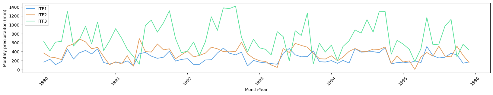
print('Input precipitation line chart: ')
# plot time series of precipitation data - TEMPORARY FOR THE DEMO
plt.rcParams["figure.figsize"] = (20,3)
fig, ax = plt.subplots()
plt.xticks(rotation = 45)
for i in range(len(regions)):
ax.plot(precip['timing'].tolist(), precip[regions[i]].tolist(), label = regions[i], color = rcolors[i])
ax.legend(loc = 'upper left')
plt.xlabel("Month-Year")
plt.ylabel("Monthly precipitaiton (mm)")
plt.show()
## calculate WASP Index (Weighted Anomaly Standardized Precipitation) monthly threshold
# empty arrays and tables for intermediate and final results
WASP = []
WASP_global = []
drought_class = precip.copy()
# prepare output for drought event index - WASP_j- list of lists wasp = [[rid1], [rid2], ...]
for i in range(1, len(precip.columns)):
# For every NUTS2 out of all regions - do the following:
# empty array for the monthly water deficit thresholds
t_m = []
for mon_ in range(1, 13):
# For every month out of all all months (January, ..., December) - do the following:
# calculcate monthly dropught threshold -\
# using a division of the data into to clusters with the Jenks' (Natural breaks) algorithm
r_idx = precip.index[precip.timing.dt.month == mon_].tolist()
t_m_last = jenkspy.jenks_breaks(precip.iloc[r_idx, i], n_classes = 2)[1]
t_m.append(t_m_last)
# Define every month with water deficity (precipitation < threshold) as a drought month
drought_class.iloc[r_idx, i] = (drought_class.iloc[r_idx, i] < t_m_last).astype(int)
# calculate annual water deficit threshold
t_a = sum(t_m)
# calculate droughts' magnitude and duration using the WASP indicator
WASP_tmp = []
first_true=0
index = []
for k in range(1, len(precip)):
# for evary row (ordered month-year combinations):
# check if droguht month -> calculate drought accumulated magnitude (over 1+ months)
if drought_class.iloc[k, i]== 1:
if first_true==0:
# if this is the first month in a drought event:
index = drought_class.timing.dt.month[k] - 1
# WASP monthly index: [(precipitation - month_threshold)/month_threshold)]*[month_threshold/annual_treshold]
WASP_last=((precip.iloc[k,i] - t_m[index])/t_m[index])* (t_m[index]/t_a)
# append calculated monthly wasp to WASP array.
WASP_tmp.append(WASP_last)
first_true=1
else:
# if this is NOT the first month in a drought event:
index = drought_class.timing.dt.month[k] - 1
#identify_t_m(k = k)
WASP_last=((precip.iloc[k,i] - t_m[index])/t_m[index])* (t_m[index]/t_a)
# add the calculated monthly wasp to last element in the WASP array (accumulative drought).
WASP_tmp[-1]=WASP_tmp[-1] + WASP_last
WASP_global.append(WASP_last)
else:
# check if not drought month - do not calculate WASP
first_true=0
WASP.append(np.array(WASP_tmp))
# calculate the exceedance probability from the median global WASP as the Hazard index (dH)
dH = []
WASP = np.array(WASP, dtype=object)
# calculate global median deficit severity -
# set drought hazard (dH) as the probability of exceeding the global median water deficit.
median_global_wasp = np.nanmedian(WASP_global)
# calculate dH per region i
for i in range(WASP.shape[0]):
dH.append(round(1 - np.nansum(WASP[i] >= median_global_wasp) / len(WASP[i]), 3))
output['hazard_raw'] = dH
Input precipitation data (top 3 rows):
      timing  ITF1  ITF2  ITF3
0 1990-01-01   169   370   626
1 1990-02-01   230   282   416
2 1990-03-01   111   265   613


Input precipitation line chart:
# Load exposure data
exposure = pd.read_csv(os.path.join(workflow_folder, "E_sample.csv"))


# show data

print('Input exposure data (top 3 rows): ')
print(exposure)

# set DEA(loud = True) to print optimization status/details
dea_e = DEA(exposure.to_numpy()[:,1:],\
          np.array([1000.,1000.,1000.]).reshape(3,1),\
         loud = False) # we use a dummy factor for the output
dea_e.name_units(['RID1', 'RID2', 'RID3'])

# returns a list with regional efficiencies
dE = dea_e.fit()

output['exposure_raw'] = dE
Input exposure data (top 3 rows):
  Country_Name   Exposure_1  Exposure_2  Exposure_3
0         ITF1  1790.348800       10.52       33.62
1         ITF2  2998.501158       32.74       52.33
2         ITF3  6802.804519        5.53        9.05
# Load vulnerability data
vulnerability = pd.read_csv(os.path.join(workflow_folder, "V_sample.csv"))

# show data

print('Input vulnerability data (top 3 rows): ')
print(vulnerability.head(3))

factorsString = ['Social', 'Economic', 'Infrast']
d_v = []

for fac_ in factorsString:
    factor_subset = vulnerability.loc[:, vulnerability.columns.str.contains(fac_)]
    dea_v = DEA(factor_subset.to_numpy()[:, 1:],\
          np.array([1000.,1000.,1000.]).reshape(3,1),\
          loud = False)
    dea_v.name_units(['RID1', 'RID2', 'RID3'])

# returns three lists with regional efficiencies for each factor
    d_v_last = dea_v.fit()
    d_v.append(d_v_last)

dV = np.nanmean(np.array(d_v), axis = 0)

output['vulnerability_raw'] = dV
Input vulnerability data (top 3 rows):
  Country_Name  Social_1  Social_2  Social_3  Economic_1  Economic_2  \
0         ITF1   1820.34     37.98    546.45         313       65.36
1         ITF2   3552.20     25.25    694.25         171       47.36
2         ITF3   5241.98      5.55    983.47         158       25.39

   Economic_3  Infrastructural_1  Infrastructural_2  Infrastructural_3
0        0.25              30.25              54.25            4563.25
1        0.49              70.36              65.36            4587.34
2        0.36              23.01              47.65            8963.54
Calculate the Risk Index for each region
R = []

for i in range(0, len(regions)):
        R_last = round(dH[i] * dE[i] * dV[i], 3)
        R.append(R_last)

output['risk_raw'] = R
Plot results#
output['risk_cat'] = [(int(np.ceil(x * 5))) for x in output['risk_raw']]

# keep index
nuts_idx = nuts.index
nuts = nuts.merge(output, on='NUTS_ID')
nuts = nuts.set_index(nuts_idx)

print("Example for results: ")
print(output.head())
print('\n')

# plot risk map

fig = px.choropleth(nuts, geojson=nuts.geometry, locations=nuts.index, color='risk_cat',\
                  color_continuous_scale="reds", range_color = [1,5])
                   #color_discrete_sequence="reds", range_color = [1, 5]) #  range_color=[0,5]
fig.update_geos(fitbounds="locations", visible=False)
fig.update_layout(title="Drought Risk",
                 coloraxis_colorbar=dict(
                    title= "Risk category",
                    tickvals = [1, 2, 3, 4, 5],
                    ticktext = [1, 2, 3, 4, 5]
                 ))

fig.show()
Example for results:
  NUTS_ID  hazard_raw  exposure_raw  vulnerability_raw  risk_raw  risk_cat
0    ITF1       0.643         1.000              1.000     0.643         4
1    ITF2       0.700         0.633              0.896     0.397         2
2    ITF3       0.824         1.000              1.000     0.824         5
# plot risk components scatter plot
print('\n')
print('Explore drought risk dimensions (marker size indicates risk category): ')
fig2 = px.scatter_3d(nuts, x='hazard_raw',\
                     y='exposure_raw',\
                     z='vulnerability_raw',\
                     size = 'risk_cat',\
                    color='CNTR_CODE') # nuts.index
fig2.update_layout(
    scene = dict(
        xaxis = dict(nticks=6, range=[0,1]),\
        xaxis_title = 'Hazard',\
        yaxis = dict(nticks=6, range=[0,1]),\
        yaxis_title = 'Exposure',\
        zaxis = dict(nticks=6, range=[0,1]),
        zaxis_title='Vulnerability',\
        aspectmode = "manual",
        aspectratio = dict(x = 0.9, y = 0.9, z = 0.9)),
    legend = dict(title = "Country code"),
    height = 700)

fig2.show()
Explore drought risk dimensions (marker size indicates risk category):
Conclusions#
The above workflow demonstrates the formation and visualization of Drought Risk Map. It is implemented using artificial data for sample regions and therefore it is hard to draw actual conclusions out of it. However, we use it to demonstrate that the risk is determined by the product of all three factors, so it is not necssarily the case that regions with the higher hazard have also higher risk. For example, the higher hazard in Molise is offset by lower exposure and vulnerability, whereas Abruzzo has lower hazard but higher risk.
Contributors#
The workflow has beend developed by Silvia Artuso and Dor Fridman from IIASA’s Water Security Research Group, and supported by Michaela Bachmann from IIASA’s Systemic Risk and Reslience Research Group.
References#
[1] Zargar, A., Sadiq, R., Naser, B., & Khan, F. I. (2011). A review of drought indices. Environmental Reviews, 19: 333-349. DOI: 10.1139/a11-013
[2] Carrão, H., Naumann, G., & Barbosa, P. (2016). Mapping global patterns of drought risk: An empirical framework based on sub-national estimates of hazard, exposure and vulnerability. Global Environmental Change, 39, 108-124.
[3] Lyon, B., & Barnston, A. G. (2005). ENSO and the spatial extent of interannual precipitation extremes in tropical land areas. Journal of climate, 18(23), 5095-5109.
[4] Carrão, H., Singleton, A., Naumann, G., Barbosa, P., & Vogt, J. V. (2014). An optimized system for the classification of meteorological drought intensity with applications in drought frequency analysis. Journal of Applied Meteorology and Climatology, 53(8), 1943-1960.
[5] Sherman, H. D., & Zhu, J. (2006). Service productivity management: Improving service performance using data envelopment analysis (DEA). Springer science & business media.