Extreme precipitation: Examples on how to carry out a climate risk assessment#
A workflow from the CLIMAAX Handbook and HEAVY RAINFALL GitHub repository.
See our how to use risk workflows page for information on how to run this notebook.
Examples of how to develop a risk assessment#
In this section, you can check real-world examples on how to carry out a risk assessment following the guidelines presented in this workflow. Feel free to explore the code and modify it according to your specific needs.
List of examples:#
Prepare your workspace#
Find out about the Python libraries we will use in this notebook.
xarray - Introduces labels in the form of dimensions, coordinates and attributes on top of raw NumPy-like arrays for a more intuitive experience.
rioxarray - An extension of the xarray library that simplifies working with geospatial raster data.
osmnx - A Python package to easily download, model, analyze, and visualize street networks and other geospatial features from OpenStreetMap.
matplotlib - A versatile plotting library in Python, commonly used for creating static, animated, and interactive visualizations.
cartopy - A package designed for geospatial data processing in order to produce maps and other geospatial data analyses.
contextily - To retrieve matplotlib compatible tile maps from the internet.
pyproj - A Python interface to PROJ (cartographic projections and coordinate transformations library).
geopandas - extends the datatypes used by pandas to allow spatial operations on geometric types.
Load libraries#
# Libraries to download data and manage files
import os
import glob
import osmnx
import pooch

# Libraries for numerical computations, array manipulation and statistics.
import xarray as xr
import pandas as pd
import numpy as np
from scipy.spatial import cKDTree
import rasterstats

# Libraries to handle geospatial data
import rioxarray as rio
import geopandas as gpd
from shapely import box
import pyproj
import rasterio
import pyproj

# Libraries to plot maps, charts and tables
import matplotlib as mpl
import matplotlib.pyplot as plt
from matplotlib.colors import from_levels_and_colors, ListedColormap, BoundaryNorm
import matplotlib.patches as mpatches
import cartopy.crs as ccrs
import cartopy.feature as cfeature
import contextily as ctx
import osmnx as ox

# Choosing the matplotlib backend
%matplotlib inline
Example 1: Are rainfall warning levels ready for climate change? A case study in Catalonia, Spain#
The region of Catalonia is located in the northest part of Spain. Due to enhanced convective rainfall events located over the mountainous coastal basins, Catalonia is highly vulnerable to extreme rainfall events that are concentrated between September and May. These events are becoming more frequent, with some resulting in severe urban floods with numerous casualties and significant socio-economic damages. For instance, the storm Gloria in 2020 caused widespread flooding across Catalonia, leaving extensive damage, casualties and more than 500 evacuations. Several areas recorded more than 180 mm of rainfall in 24 hours during the storm, beating historical records all over the region.
To increase the preparedness and response of the region, the Meteorological Service of Catalonia (SMC) issues warnings for Dangerous Meteorological Situations due to rainfall using two critical thresholds:
Low risk: 100 mm/ 24 hours
High risk: 200 mm/ 24 hours
These have been defined based on regional studies in the Catalonia region. However, considering the increased frequency of extreme precipitation events, the impacts associated with these and the number of triggered warnings per year, the regional authorities are interested in exploring how these current official thresholds could vary due to the influence of climate change.
The objective of this risk assessment is to evaluate how these critical rainfall thresholds defined by the SMC vary in the context of climate scenarios. The results can provide officials with valuable insights into the frequency shifts of these extreme events and the magnitude of changes that could be expected. This information is key for informed decision-making and enhancing preparedness measures to mitigate the impacts of climate change.
Step 1: Select your analysis area#
For this risk assessment, two analyses will be made:
A specific location: We will focus on the city of Blanes, located in the province of Girona. Blanes has experienced extreme precipitation events in the past, including the recent storm Gloria mentioned earlier
Regional assessment: We will zoom out our analysis to cover the entire Catalonia region. This extended scope will provide insights into the overall impact of extreme precipitation across Catalonia
bbox = [0, 40.2, 3.3, 43.5]  # W, S, E, N
areaname = 'Catalonia'
Setting your directory structure#
The next cell will create the extreme_precipitation_risk folder in the directory where the notebook is saved. You can change the absolute path defined in the variable workflow_dir to create it elsewhere.
# Define the path for the extreme_precipitation_risk folder.
workflow_dir = 'extreme_precipitation_risk'

# Create the directory checking if it already exists.
os.makedirs(workflow_dir, exist_ok=True)
Now, we will create a subfolder for general data as well as specific subfolders to save data for our area of interest, plots generated by the code and new datasets computed within the workflow.
# Define directories for general data.
general_data_dir = os.path.join(workflow_dir, 'general_data')  # Pre-calculated CORDEX IDFs for Europe
# Define specific directories for the selected area
data_dir = os.path.join(workflow_dir, f'data_{areaname}')  # Pre-calculated CORDEX IDFs for Catalonia
results_dir = os.path.join(workflow_dir, f'results_{areaname}')  # Results of the risk assessment in tiff format
plots_dir = os.path.join(workflow_dir, f'plots_{areaname}')  # Plots of the risk assessment in png format

# Create the directories checking if they already exist.
os.makedirs(general_data_dir, exist_ok = True)
os.makedirs(data_dir, exist_ok = True)
os.makedirs(results_dir, exist_ok = True)
os.makedirs(plots_dir, exist_ok = True)
We also need to define the path of the extreme_precipitation_hazard folder in order to access the files previously downloaded and created in the Hazard Assessment notebook.
# Define the hazard directory
hazard_dir = 'extreme_precipitation_hazard'
# Define the subfolder's paths
hazard_general_data_dir = os.path.join(hazard_dir, 'general_data')
hazard_data_dir = os.path.join(hazard_dir, f'data_{areaname}')
hazard_results_dir = os.path.join(hazard_dir, f'results_{areaname}')
Prepare access to the ready-to-go pre-calculated European datasets#
Load the file registry for the precipitation_idf_gcm_eur dataset in the CLIMAAX cloud storage with pooch.
If any files requested below were downloaded before, pooch will inspect the local file contents and skip the download if the contents match expectations.
precip_data_pooch = pooch.create(
    path=workflow_dir,
    base_url="https://object-store.os-api.cci1.ecmwf.int/climaax/precipitation_idf_europe/"
)
precip_data_pooch.load_registry("files_registry.txt")
Step 2: Calculate or identify your critical impact-based rainfall thresholds#
As mentioned above, the two critical rainfall thresholds identified are:
Low risk: 100 mm/ 24 hours
High risk: 200 mm/ 24 hours Where the frequency/return period of these thresholds varies across the Catalonia region. The local data used for this analysis is publicly provided by the SMC here.
For the city of Blanes, the critical impact-based rainfall threshold has been defined as 100 mm/24 hours for a 5-year return period.
Step 3: Load the Hazard data#
To carry out our risk assessment, we will use the hazard dataset generated by executing the code in the Hazard Assessment Notebook (Catalonia example). Thus, we will define the DATASET_HAZARD_ASSESSMENT as True. Our analysis will compare the baseline (observations) to the period of 2041-2070.
For more details on how the hazard dataset used in this risk assessment was generated, please refer to the Hazard Assessment. Additionally, you can find information on the pre-calculated hazard datasets in the Hazard section of this workflow.
Note
If you’re using the ready-to-go pre-calculated European datasets, make sure to define the DATASET_HAZARD_ASSESSMENT as False and check for the available combinations of the Global Circulation Model (GCM) and Representative Concentration Pathways (RCP) provided in the hazard section. Once you’ve downloaded these from the pre-calculated datasets, we’ll slice them to our area of interest defined in lat/lon coordinates in the bounding box and save the new files in the data directory of the Risk Assessment notebook for easy access later on
Note
If you’re using bias-corrected European datasets, make sure to define the IS_BIAS_CORRECTED as True.
# Define global variable to define the dataset to use (False to use pre-computed datasets)
DATASET_HAZARD_ASSESSMENT = False

# Define global options for hazard dataset (matching the ones in Hazard Assessment or within the pre-computed dataset options)
GCM = 'ichec-ec-earth'
RCM = 'knmi-racmo22e'
RCP = 'rcp85'
IS_BIAS_CORRECTED = False

# Select which time-frames and durations within the available you want to study (Check for options above) or choose the ones computed in the Hazard Assessment.
TIME_FRAMES = {
    'historical' :'1976-2005',
    RCP : '2041-2070'
}

# Define durations to read/download
DURATIONS = [3, 24]

# Dictionary of hazard dataset path's (filled automatically with the information of above)
HAZARD_PATHS = {}
# (if needed) Download all files from the pre-calculated European dataset for the selected GCM/RCM
if not DATASET_HAZARD_ASSESSMENT:
    for path in precip_data_pooch.registry:
        if f"{GCM}_{RCM}" in path:
            precip_data_pooch.fetch(path)

# Fill the HAZARD_PATHS dictionary and (if needed) slice the european datasets to the area of interest
for dur in DURATIONS:
    HAZARD_PATHS[dur] = {}
    for run, years in TIME_FRAMES.items():
        if DATASET_HAZARD_ASSESSMENT:
            HAZARD_PATHS[dur][run] = os.path.join(hazard_results_dir, f'idf_{dur}h_{GCM}_{RCM}_{run}_{years}.nc')

        else:
            name_bias_folder = 'bias_corrected' if IS_BIAS_CORRECTED else 'non_bias_corrected'
            path = glob.glob(os.path.join(workflow_dir, 'hazard_assessment', name_bias_folder, f"{GCM}_{RCM}", run, f'idf_{dur}h*_{years}.nc'))[0]
            path_out = os.path.join(data_dir, os.path.basename(path))
            if not os.path.exists(path_out):
                with xr.open_dataset(path, decode_cf = True) as ds:
                    # Cut bounding box area
                    West, South, East, North = bbox
                    if IS_BIAS_CORRECTED:
                        ds = ds.where((ds.lat > South) & (ds.lat < North) & (ds.lon > West) & (ds.lon < East), drop=True)
                    else:
                        # Reproject usual coordinates (in WGS84) to EURO-CORDEX's CRS.
                        CRS = ccrs.RotatedPole(pole_latitude=39.25, pole_longitude=-162)
                        transformer = pyproj.Transformer.from_crs('epsg:4326',CRS)
                        rlon_min, rlat_min, rlon_max, rlat_max = transformer.transform_bounds(South, West, North, East)
                        # slice European dataset to area of region using boundig box.
                        ds = ds.sel(rlat = slice(rlat_min, rlat_max), rlon = slice(rlon_min, rlon_max))
                    # Save in data_dir directory for further use
                    ds.to_netcdf(path_out)
            HAZARD_PATHS[dur][run] = path_out
Step 4: Specify your critical impact-based rainfall thresholds#
To carry our risk assessment, let’s specify the critical impact-based rainfall thresholds for both Blanes and Catalonia. We will define these in terms of Magnitude, Duration and Frequency.
Keep in mind
The code below helps us translate and link our real-world data to the climate dataset projections we’re using in this workflow (non-biased corrected EURO-CORDEX). This step is necessary for improving the robustness of our analysis with the climate projections.
def magnitude_frequency_shift(th_int, th_dur, th_freq, ds_baseline, ds_horizon, is_bias_corrected):
    """ Returns the new magnitudes and frequencies of given threshold under climate change.

        th_int: intensity (critical threshold)
        th_dur: duration (critical threshold)
        th_freq: frequency (critical threshold)
        ds_baseline : dataarray of expected precipitation of the baseline period. DataArray index is expected to be 'return_period'.
        ds_horizon : same specifications as ds_baseline for future horizon (e.g. 2070)
        is_bias_corrected: if the Cordex Datasets are bias corrected (True) or non-bias corrected (False)
    """
    # Access data (return_periods and values for baseline and future)
    ret_per_bs = ds_baseline.return_period.values
    ret_per_proj = ds_horizon.return_period.values
    prec_bs = ds_baseline.values
    prec_proj = ds_horizon.values

    # Translation of threshold into baseline eurocordex (interpolation of precipitation vs. log(return periods)).
    prec_base_aux = np.interp(np.log(th_freq), np.log(ret_per_bs), prec_bs)

    ### Change in frequency
    # Get new frequency by interpolation
    shift_ret_per = np.interp(prec_base_aux, prec_proj, np.log(ret_per_proj))
    shift_ret_per = np.ceil(np.exp(shift_ret_per))

    ### Change in magnitude using proxy of baseline.
    # Get new precipitation by interpolation
    prec_proj_aux = np.interp(np.log(th_freq), np.log(ret_per_proj), prec_proj)
    factor_prec = prec_proj_aux/prec_base_aux
    shift_prec = th_int * factor_prec

    # Rounding values to 2 decimals.
    shift_prec = round(shift_prec, 2)
    factor_prec = round(factor_prec, 2)

    return shift_ret_per, shift_prec, factor_prec
4.1 For a specific-site: Blanes city, Catalonia#
# Define the parameters of your threshold.
INTENSITY_TH = 100     # in mm
DURATION_TH = 24       # in hours
FREQUENCY_TH = 5       # in years

# Lat/lon coordinates for Blanes locality.
POINT = [41.674, 2.792]
# Read historical IDF for point
if IS_BIAS_CORRECTED:
    ds_hist = xr.open_dataset(HAZARD_PATHS[DURATION_TH]['historical'], decode_cf=True)
    ds_proj = xr.open_dataset(HAZARD_PATHS[DURATION_TH][RCP], decode_cf=True)

    # Get flattened lat/lon arrays
    flat_lat = ds_hist.lat.values.ravel()
    flat_lon = ds_hist.lon.values.ravel()
    points = np.column_stack((flat_lat, flat_lon))

    # Build KDTree and find nearest point
    tree = cKDTree(points)
    _, idx = tree.query([POINT[0], POINT[1]])

    # Get nearest index in the original dataset
    y_idx, x_idx = np.unravel_index(idx, ds_hist.lat.shape)

    # Select the nearest point
    ds_hist = ds_hist.isel(y=y_idx, x=x_idx, drop=True).sel(duration=DURATION_TH).idf

    # Read future IDF for point
    ds_proj = ds_proj.isel(y=y_idx, x=x_idx, drop=True).sel(duration=DURATION_TH).idf
else:
    # Transform POINT to Hazard dataset reference system
    CRS = ccrs.RotatedPole(pole_latitude=39.25, pole_longitude=-162)
    transformer = pyproj.Transformer.from_crs('epsg:4326', CRS)
    rpoint = transformer.transform(POINT[0], POINT[1])

    ds_hist = xr.open_dataset(HAZARD_PATHS[DURATION_TH]['historical'], decode_cf=True)
    ds_hist = ds_hist.sel(rlat = rpoint[1], rlon = rpoint[0], duration=DURATION_TH, method = 'nearest', drop=True).idf

    # Read future IDF for point
    ds_proj = xr.open_dataset(HAZARD_PATHS[DURATION_TH][RCP], decode_cf=True)
    ds_proj = ds_proj.sel(rlat = rpoint[1], rlon = rpoint[0], duration=DURATION_TH, method='nearest', drop=True).idf

# Apply function to poing
shift_point = magnitude_frequency_shift(INTENSITY_TH, DURATION_TH, FREQUENCY_TH, ds_hist, ds_proj, IS_BIAS_CORRECTED); del ds_hist, ds_proj
4.2 For the entire region of Catalonia#
For the Catalonia region, we need to determine how the critical rainfall threshold of 100 mm/24 hours varies with different return periods. But first, we need to specify our critical rainfall thresholds on a regional scale. For this, we have followed the below steps:
Download Local Data: We identified and downloaded the official maps that show maximum precipitation for different durations (1, 6, 12, 24, and 48 hours) and various return periods (2, 5, 10, 20, 50, 100, 200, and 500 years). For our analysis, we have focused specifically on the 24-hour duration return period maps (8 in total). Access the publicly available rainfall maps provided by the Meteorological Service of Catalonia (SMC) here.
Scan Maps for Rainfall Thresholds: For each pixel, we checked the precipitation values across all the 8 available return periods associated with a duration of 24 hours. This helped us identify the return period at which the precipitation exceeds the 100 mm threshold. For example, in pixel A, we scan through the 8 return periods maps until we exceed the 100 mm/24 hours.
Create the Threshold Map: By applying a linear interpolation, we have assembled a new map where each pixel shows the return period corresponding to the 100 mm/24-hour critical threshold. This map indicates the frequency with which this threshold is exceeded across different areas of Catalonia.
This regional “critical rainfall threshold” map will help us explore the overall changes of the 100mm/24 hour threshold within the context of climate change.
To understand how to create this threshold map for Catalonia, check out the code below. Feel free to adjust it based on your specific local data and needs.
Can’t access historical rainfall data from your local meteorological office?
No problem! There are alternative datasets you can use for your regional analysis:
ERA5: A climate reanalysis dataset from ECMWF, providing hourly data starting from 1950. It covers a wide range of atmospheric parameters, available on a grid with 0.25 x 0.25 degree resolution.
CERRA: A regional reanalysis dataset focused on Europe, provided by the SMHI. It covers the period from September 1984 to June 2021, with a resolution of 5.5 km.
These datasets are publicly available at the Climate Data Store. Once you’ve chosen and downloaded one of these datasets, apply the Hazard Assessment section of this notebook to calculate your local return periods. After that, you’ll have the dataset you need to move on to the next steps of your regional analysis!
Define an Interpolation Function#
The code below creates a function to perform linear interpolation (and extrapolation if necessary) to estimate the return periods corresponding to our critical intensity threshold of 100 mm/24 hours at each pixel.
def linear_extrapolation(x_points, y_points, x, nodata=None):
    """ Performs linear interpolation or extrapolation to find the value y at point x.

    Parameters:
    x_points (array-like): The rainfall intensities for different return periods
    y_points (array-like): The corresponding return periods.
    x (float): The intensity at which to interpolate (our critical intensity threshold).
    nodata (float, optional): The nodata value to handle missing data.

    Returns: float: The interpolated return period at intensity x.
     """

    # nodata
    if np.any(x_points == nodata):
        return nodata
    # Left extrapolation
    if x < x_points[0]:
        slope = (y_points[1] - y_points[0]) / (x_points[1] - x_points[0])
        return max(1e-10, y_points[0] + slope * (x - x_points[0]))
   # Right extrapolation
    elif x > x_points[-1]:
        slope = (y_points[-1] - y_points[-2]) / (x_points[-1] - x_points[-2])
        return y_points[-1] + slope * (x - x_points[-1])
    # Normal interpolation
    else:
        return np.interp(x, x_points, y_points)
Read and process Intensity-Duration-Frequency local maps#
We need to load the 24-hour duration return period maps (8 in total). Feel free to modify the code below with your own data to replicate this example.
# Download return period maps from prepared dataset
for path in precip_data_pooch.registry:
    if "CLIMA_IDF2020" in path:
        precip_data_pooch.fetch(path)

# Read all IDFs
rp = [2, 5, 10, 20, 50, 100, 200, 500]
list_files = sorted(glob.glob(os.path.join(workflow_dir, 'risk_assessment', 'IDF_CAT', "CLIMA_IDF2020_*.tif")))

# Get metadata
meta = rasterio.open(list_files[0]).meta

# Read data
idf_cat = np.zeros((len(rp), meta['height'], meta['width']))
for i, f in enumerate(list_files):
    idf_cat[i, :, :] = rasterio.open(f).read(1)
Interpolate Return Periods Across Catalonia#
For each pixel in the region, the code below applies the defined function in the previous section to interpolate the return period corresponding to our critical intensity threshold (100 mm in 24 hours).
# Do the interpolation to get the RP for the 100mm
ds_rp_th = np.apply_along_axis(linear_extrapolation, 0, idf_cat, rp, INTENSITY_TH, nodata=meta['nodata'])

# Save the RP tiff
path_rp_th = os.path.join(results_dir, 'RP_CAT_threshold_100mm.tiff')
with rasterio.open(path_rp_th, 'w', **meta) as dst:
        dst.write(ds_rp_th, 1)
Calculate Shifts in Return Periods and Precipitation Magnitudes.#
Will events associated with our threshold increase in frequency? Will the magnitude of these events increase? Or will we see a decline in rainfall?
At this stage, we are now ready to calculate how our critical thresholds will vary in the context of climate scenarios in Catalunya. The code below uses historical and future hazard datasets to compute how return periods and precipitation magnitudes shift under future climate scenarios.
# Load and plot the return period for critical threshold.
print("Loading Catalonia thresholds...")
ds_rp_th = rio.open_rasterio(path_rp_th)

# Access projection and data values
proj_rp_th = ds_rp_th.rio.crs
transform_rp_rh = ds_rp_th.rio.transform()
nvar, ny, nx = ds_rp_th.shape
data = ds_rp_th.values

# Create new arrays for return period shift, precipitation shift and precipitation factor.
sh_rp = np.full((ny,nx), fill_value=ds_rp_th._FillValue, dtype='float32')
sh_prec = np.full((ny,nx), fill_value=ds_rp_th._FillValue, dtype='float32')
sh_prec_factor = np.full((ny, nx), fill_value=ds_rp_th._FillValue, dtype='float32')

# Transform lat/lon coordinates into Hazard Dataset CRS.
xy_th = np.asarray(np.where(data > 0))[[2,1],:]
if IS_BIAS_CORRECTED:
    CRS = pyproj.CRS("EPSG:4326")
else:
    CRS = ccrs.RotatedPole(pole_latitude=39.25, pole_longitude=-162)
trans_th_haz = pyproj.Transformer.from_crs(proj_rp_th, CRS)
lonlat_th = np.asarray(trans_th_haz.transform(ds_rp_th.x[xy_th[0]], ds_rp_th.y[xy_th[1]]))

# Read historical and future datasets
ds_hist = xr.open_dataset(HAZARD_PATHS[DURATION_TH]['historical'], decode_cf=True)
ds_future = xr.open_dataset(HAZARD_PATHS[DURATION_TH][RCP], decode_cf=True)

if IS_BIAS_CORRECTED:
    # Get flattened lat/lon arrays
    flat_lat = ds_hist.lat.values.ravel()
    flat_lon = ds_hist.lon.values.ravel()
    points = np.column_stack((flat_lat, flat_lon))
    # Build KDTree and find nearest point
    tree = cKDTree(points)

# Loop over each pixel to compute transformation
for i in range(len(xy_th[0])):
    th_rp_i = ds_rp_th.isel(x = xy_th[0, i], y = xy_th[1, i]).values[0]
    if IS_BIAS_CORRECTED:
        _, idx = tree.query([lonlat_th[0, i], lonlat_th[1, i]])  # Query with original lat/lon
        # Get nearest index in the original dataset
        y_idx, x_idx = np.unravel_index(idx, ds_hist.lat.shape)
        data_hist = ds_hist.isel(y=y_idx, x=x_idx, drop=True).sel(duration=DURATION_TH).idf
        data_future = ds_future.isel(y=y_idx, x=x_idx, drop=True).sel(duration=DURATION_TH).idf
    else:
        data_hist = ds_hist.idf.sel(rlon = lonlat_th[0,i], rlat = lonlat_th[1,i], method='nearest').sel(duration=DURATION_TH)
        data_future = ds_future.idf.sel(rlon = lonlat_th[0,i], rlat = lonlat_th[1,i], method='nearest').sel(duration=DURATION_TH)

    # Calling shift function
    shift = magnitude_frequency_shift(INTENSITY_TH, DURATION_TH, th_rp_i, data_hist, data_future, IS_BIAS_CORRECTED)
    sh_rp[xy_th[1, i], xy_th[0, i]] = shift[0]
    sh_prec[xy_th[1, i], xy_th[0, i]] = shift[1]
    sh_prec_factor[xy_th[1, i], xy_th[0, i]] = shift[2]
Save the Results#
The calculations are done! Use the code below to save the computed shifts as GeoTIFF files for visualisation and further analysis.
def write_geotiff(filename, data):
    path_tiff = os.path.join(results_dir, filename)
    # Define nodata value (use the same as in your dataset or define your own)
    nodata_value = ds_rp_th._FillValue

    # Replace -inf with nodata
    data = np.where(np.isneginf(data), nodata_value, data)
    data = np.where(np.isinf(data), nodata_value, data)

    with rasterio.open(
        path_tiff,
        'w',
        driver='GTiff',
        height=data.shape[0],
        width=data.shape[1],
        count=1,
        dtype='float64',
        crs=proj_rp_th.to_wkt(),
        nodata=ds_rp_th._FillValue,
        transform=transform_rp_rh,
        tiled=True,
        copy_src_overviews=True,
        compress='DEFLATE',
        predictor=3
    ) as dst:
        dst.write(data, 1)

# Save each variable as GeoTIFF in results directory.
filename_rp = f"RP_shift_threshold_{INTENSITY_TH}mm_{DURATION_TH}h_{GCM}_{RCM}_{RCP}_{TIME_FRAMES['historical']}_{TIME_FRAMES[RCP]}.tiff"
write_geotiff(filename_rp, sh_rp)

filename_prec = f"PREC_shift_threshold_{INTENSITY_TH}mm_{DURATION_TH}h_{GCM}_{RCM}_{RCP}_{TIME_FRAMES['historical']}_{TIME_FRAMES[RCP]}.tiff"
write_geotiff(filename_prec, sh_prec)

filename_factor = f"PREC_factor_threshold_{INTENSITY_TH}mm_{DURATION_TH}h_{GCM}_{RCM}_{RCP}_{TIME_FRAMES['historical']}_{TIME_FRAMES[RCP]}.tiff"
write_geotiff(filename_factor, sh_prec_factor)
Step 5: Let’s explore our results: Blanes city (specific location)#
As a quick reminder, the objective of this risk assessment is to explore how the current critical impact-based rainfall thresholds will vary in terms of frequency and magnitude. In other words, we want to understand how rainfall patterns might change in the future while either maintaining the current frequency or magnitude of our critical thresholds.
In the case of Blanes, a city located in the province of Girona, we can analyse how the critical rainfall threshold of 100 mm in 24 hours, associated with a 5-year return period, is expected to change under future climate scenarios.
In the case of Blanes (a specific location), we can print the results using the code below:
print(f"For the period of {TIME_FRAMES[RCP]}, the critical impact-based rainfall threshold of {INTENSITY_TH} mm/{DURATION_TH} hours, associated with a {FREQUENCY_TH}-year return period:")
print(f"   * If we want to maintain the same frequency (return period), the magnitude will vary by {(shift_point[2]-1)*100:.2f} % from the current threshold")
print(f"   * If we want to maintain the same magnitude, the frequency (return period) will change from {FREQUENCY_TH} to {shift_point[0]} years.")
For the period of 2041-2070, the critical impact-based rainfall threshold of 100 mm/24 hours, associated with a 5-year return period:
   * If we want to maintain the same frequency (return period), the magnitude will vary by 25.00 % from the current threshold
   * If we want to maintain the same magnitude, the frequency (return period) will change from 5 to 3.0 years.
Explanation
Magnitude Change: If we aim to maintain the same frequency of events (return period of 5 years), the magnitude of the critical rainfall threshold would need to increase by 18%, from 100 mm to approximately 118 mm. This means that heavier rainfall would be required to occur with the same frequency as before in Blanes.
Frequency Change: If we cannot tolerate a magnitude change and would like to keep it the same (100 mm in 24 hours), the frequency (return period) would decrease from 5 years to 3 years. This implies that such extreme rainfall events are expected to become more frequent in the future.
These results suggest that Blanes may experience more intense or more frequent extreme rainfall events under future climate scenarios. These results can be helpful for local authorities in Blanes to update their risk management strategies and infrastructure planning to mitigate potential impacts according to the local risk tolerance.
Step 6: Impact across the region - Extreme precipitation in Catalonia results#
To understand the broader impact across Catalonia, we can create visualizations to better comprehend the changes in magnitude and frequency of our critical thresholds for the period of 2041-2070. Additionally, as mentioned in the section “Things to consider”, it is also beneficial to explore and visualise how the critical thresholds can vary in the context of different chains of GCM/RCM but only one RCP scenario (multi-model-ensemble) or one model and different RCP scenarios (multi-scenario-ensemble)
Below are examples of different maps that can help you understand and identify the effects of climate scenarios in your critical rainfall threshold at a regional scale
Feel free to adapt the below visualisations for your specific region!
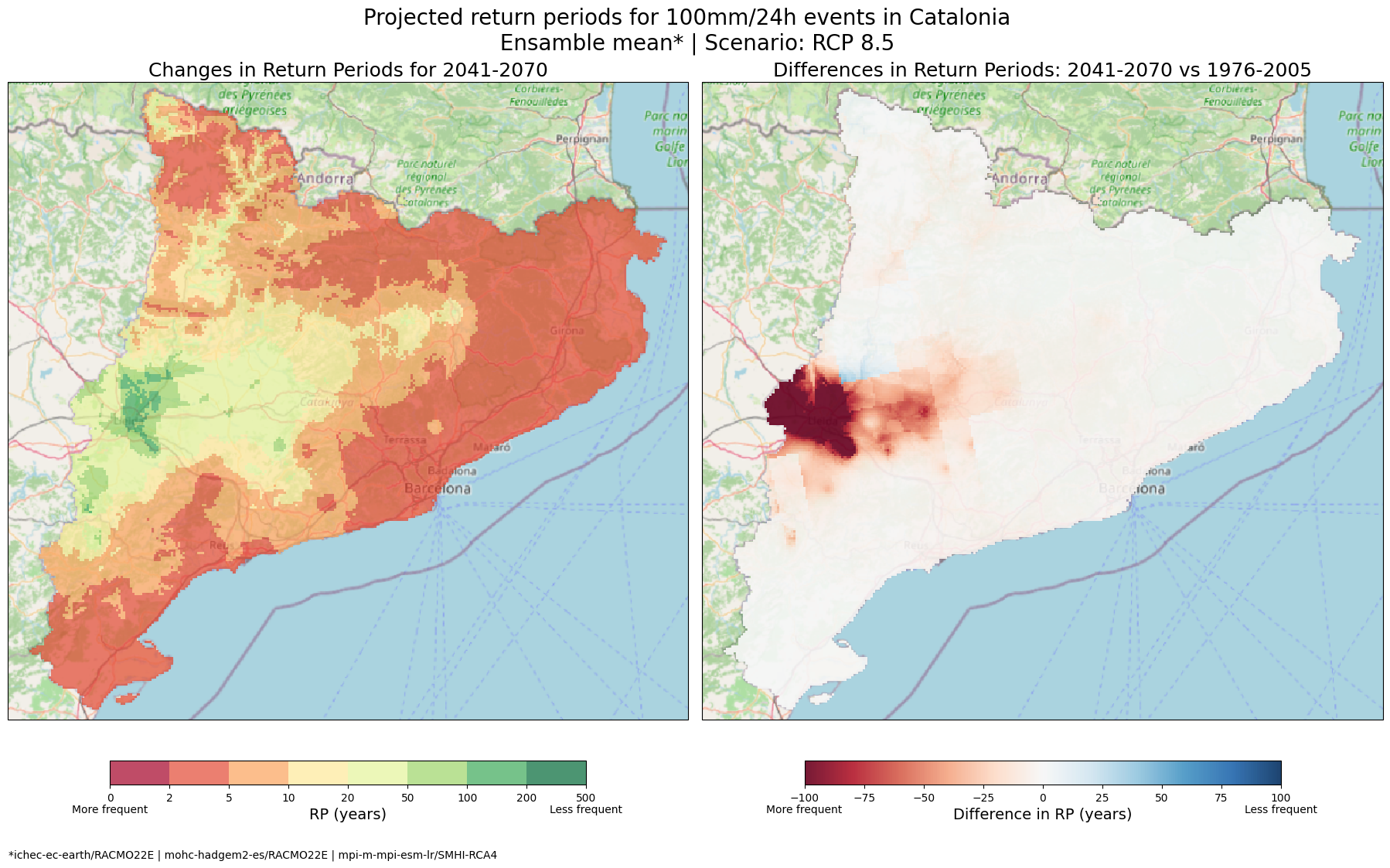
6.1 Will the frequency of 100 mm in 24 hours events increase or decrease in the near-future in Catalonia? Visualising the Difference in Return Periods#
Let’s start by generating side-by-side maps that compare the current return periods with the expected future return periods for the 100 mm/24h threshold across Catalonia. These maps will help us see how frequently these events are projected to occur in the near future, allowing us to identify areas where the risk of extreme rainfall is increasing or decreasing.
# Path of rasters to plot.
path_rp_current = os.path.join(results_dir, 'RP_CAT_threshold_100mm.tiff')
path_rp_future = glob.glob(os.path.join(results_dir, 'RP_shift*.tiff'))[0]

# Read data
ds_current = rio.open_rasterio(path_rp_current, masked =True)
ds_future = rio.open_rasterio(path_rp_future, masked =True)

# Convert projection so matplotlib understands it.
proj_rp = ds_current.rio.crs
proj_rp = ccrs.epsg(proj_rp.to_epsg())

# Define colorbar.
cmap_ret_per = plt.get_cmap("RdYlGn")
bounds_ret_per = [0, 2, 5, 10, 20, 50, 100, 200, 500]
norm_ret_per = mpl.colors.BoundaryNorm(bounds_ret_per, cmap_ret_per.N)

# Initialize Figure
fig_rp, ax_rp = plt.subplots(1,2, figsize = (18,11), subplot_kw = {'projection': proj_rp}, layout = 'constrained')

# Plot current RP
im_current = ds_current.plot(ax = ax_rp[0], add_colorbar=False, norm = norm_ret_per, cmap=cmap_ret_per, alpha = 0.7)
ctx.add_basemap(ax=ax_rp[0], crs=proj_rp, source=ctx.providers.OpenStreetMap.Mapnik, attribution = False)
ax_rp[0].set_title('Current return period (1976-2005)')

# Plot future RP
im_future = ds_future.plot(ax = ax_rp[1], add_colorbar=False, norm = norm_ret_per, cmap=cmap_ret_per, alpha = 0.7)
ctx.add_basemap(ax=ax_rp[1], crs=proj_rp, source=ctx.providers.OpenStreetMap.Mapnik, attribution = False)
ax_rp[1].set_title('Projected return period under RCP 8.5 (2041-2070)')

# Add colorbar
cb_rp = fig_rp.colorbar(im_future, ax = ax_rp[:], ticks=bounds_ret_per, location='bottom', shrink = 0.7)
cb_rp.set_label('RP (years)', fontsize = 14)
cb_rp.ax.text(0, -0.5, 'More frequent', ha='center', va='top', transform=cb_rp.ax.transAxes)
cb_rp.ax.text(1, -0.5, 'Less frequent', ha='center', va='top', transform=cb_rp.ax.transAxes)

# Add title
fig_rp.suptitle(f"Projected Changes in Return Period (Frequency) for 100mm/24h Events: 1976-2005 to 2041-2070 \n Model Chain: ICHEC-EC-Earth / RACMO22E  | Scenario: RCP 8.5",fontsize = 16)

# Show and save plot
plt.show()
fig_rp.savefig(os.path.join(plots_dir, f'RP_shift_threshold_{TIME_FRAMES[RCP]}.png'))
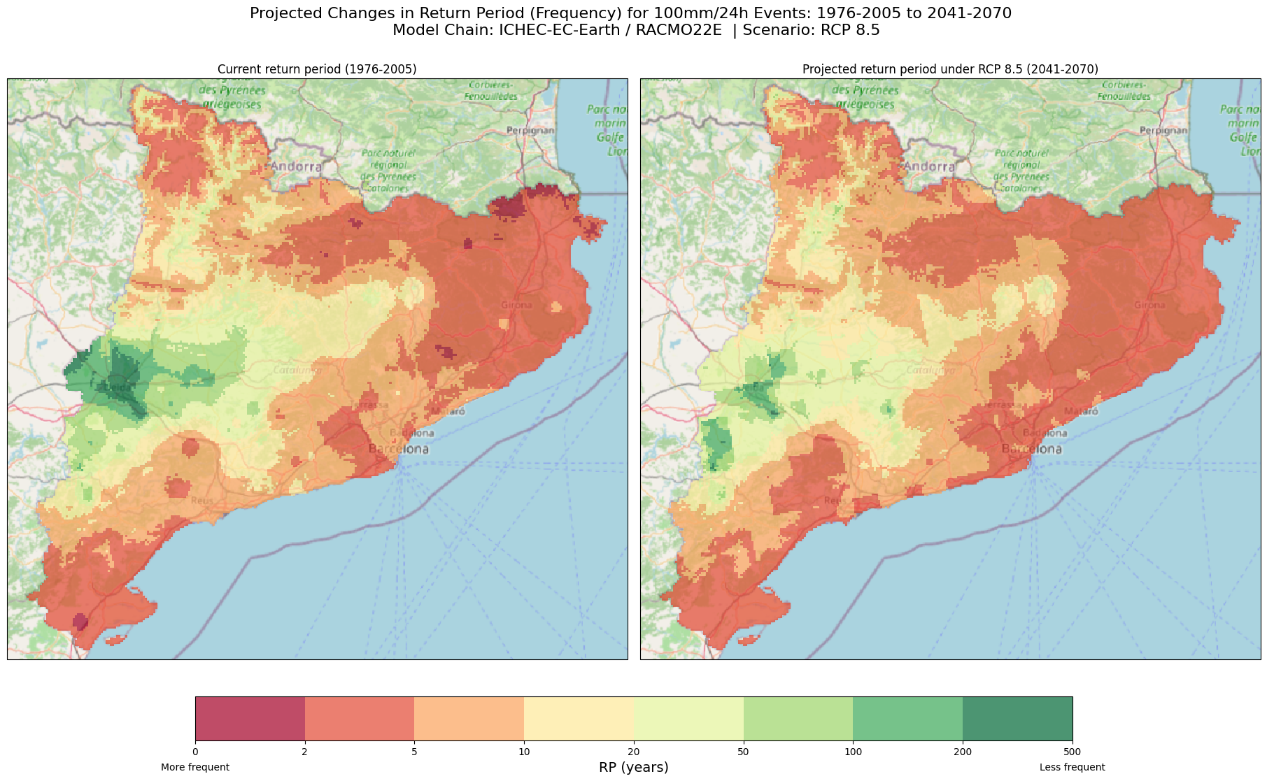
Return Period and Frequency of events.
Please remember that the return period represents the average time in years between extreme events. If the value of the return period increases, it means the event will happen less frequently. On the other hand, if the value of the return period decreases, the event will happen more frequently. So, a longer return period means fewer events, while a shorter return period means more frequent events.
Explanation
Maps Description: The left map shows the current return periods for the 100 mm/24h rainfall threshold across Catalonia, while the right map displays the expected return periods for the same threshold under the future climate scenario (2041-2070).
Colour Scale: The colorbar represents the return periods in years. A shift towards lower return periods indicates that extreme rainfall events are expected to become more frequent. Thus, red and orange areas indicate regions with frequent occurrences (short return periods), while yellow to green regions have longer return periods, indicating that 100 mm/24 events are less frequent.
How to interpret the maps: By comparing the two maps, we can identify areas where the frequency of extreme rainfall events is projected to increase significantly. For Catalonia, these maps present an increase of frequency for 100 mm/24h events in many areas under the RCP85 scenario, with only some regions seeing reduced frequency.
Why are these maps useful? They can provide a general overview of the changes in frequency of 100 mm in 24 events across the Catalonia region. This information can be a first step for local governments and planners to visualise and identify areas at risk
6.2 Where in Catalonia will the frequency of 100 mm in 24 hours events increase and decrease? Let’s highlight extreme frequency changes in the region with a difference map#
Now that we’ve compared the current and future return periods for 100 mm/24h rainfall events, we can identify the areas in Catalonia where the frequency of these extreme events is expected to change the most.
To identify the most problematic areas—where the risk of 100mm/24h events will increase or decrease in frequency significantly—we’ll create a difference map. This map will highlight the regions where the changes in frequency are the most significant, helping us focus on areas that may need attention and planning.
# Path of rasters to plot.
path_rp_current = os.path.join(results_dir, 'RP_CAT_threshold_100mm.tiff')
path_rp_future = glob.glob(os.path.join(results_dir, 'RP_shift*.tiff'))[0]

# Read data and calculate difference
current_data = rio.open_rasterio(path_rp_current, masked =True)
future_data = rio.open_rasterio(path_rp_future, masked =True)
diff_data = future_data - current_data

# Convert projection so matplotlib understands it.
proj_rp = ds_current.rio.crs
proj_rp = ccrs.epsg(proj_rp.to_epsg())

# Plot difference RP
fig, ax = plt.subplots(figsize = (17,10), subplot_kw = {'projection': proj_rp}, layout = 'constrained')
im_diff = diff_data.plot(ax = ax, add_colorbar=False,cmap='RdBu', vmin=-100, vmax=100, alpha = 0.9)
ctx.add_basemap(ax=ax, crs=proj_rp, source=ctx.providers.OpenStreetMap.Mapnik, attribution = False)

# Add colorbar
cb_diff = fig.colorbar(im_diff, ax = ax, location ='bottom', shrink = 0.5 )
cb_diff.set_label('Difference in Return Period (years)')
cb_diff.ax.text(1, -0.8, 'Less frequent', ha='center', va='top', transform=cb_diff.ax.transAxes)
cb_diff.ax.text(0, -0.8, 'More frequent', ha='center', va='top', transform=cb_diff.ax.transAxes)

# Add title
ax.set_title(f'Model Chain: ICHEC-EC-Earth / RACMO22E  | Scenario: RCP 8.5')
fig.suptitle(f'Shift in Return Periods (frequency) for 100mm/24h Events: 2041-2070 vs 1976-2005',fontsize = 16)

# Show and save plot
plt.show()
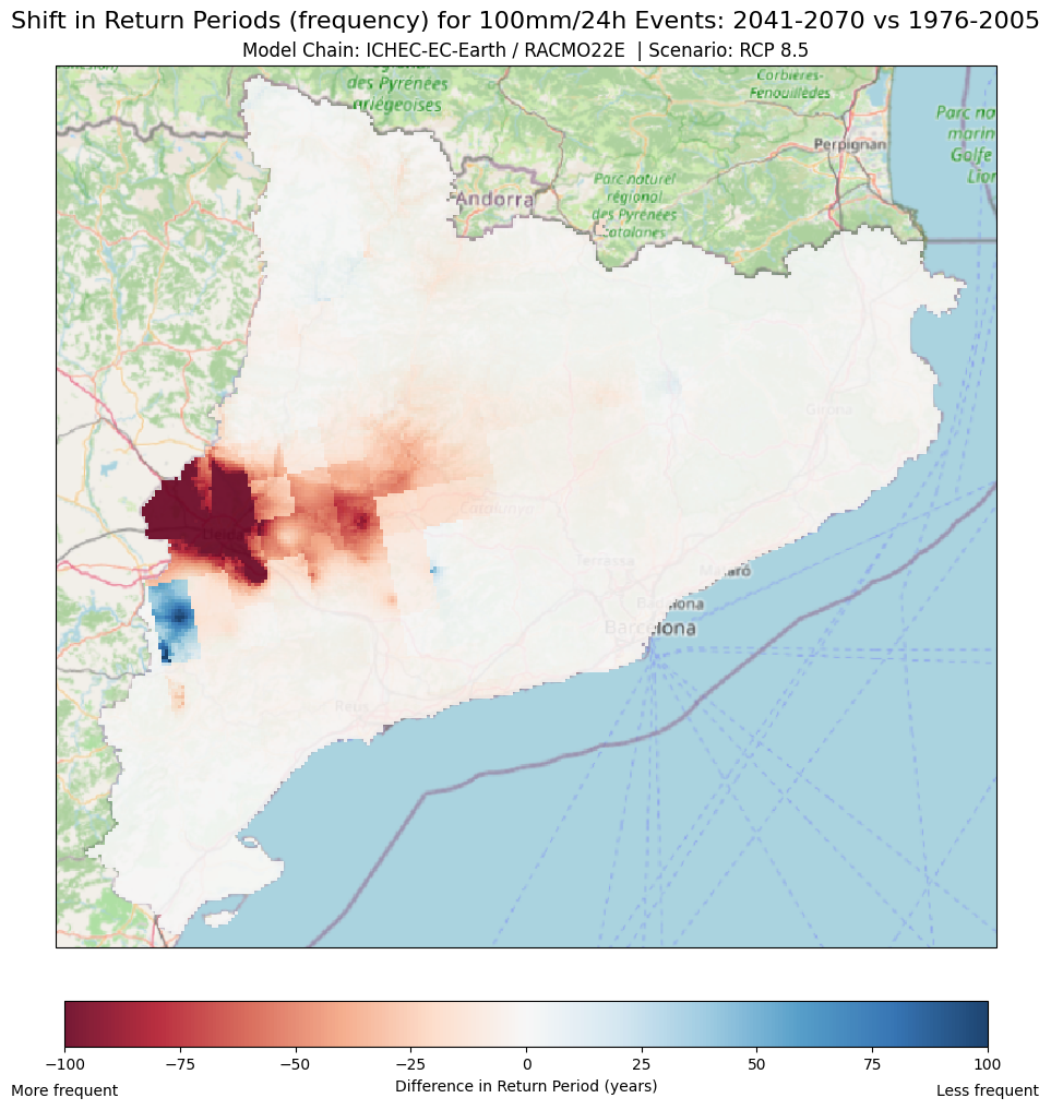
Explanation
Maps Description: The difference map compares the return periods for a 100mm/24h rainfall event between the current period and the future projection (2041-2070) under the RCP 8.5 scenario.
Colour Palette: The colours represent how much the return period changes between the current and future projections.
Red areas: These indicate decreases in the return period, meaning that 100mm/24 events are expected to occur more frequently in the future.
Blue areas: In contrast, these indicate an increase in the return period, meaning that 100mm/24h events will become less frequent in the future.
White/neutral colours: Areas where little or no change is expected (difference close to zero)
Visualisation scale: The scale has been set from -100 to +100 years. For this particular example, this scale makes it easier to identify and focus on the areas where the return period (frequency) changes drastically. For example:
If an area’s (pixel) return period decreases from 150 years (1976-2005) to 50 years (2041-2070), this implies a change of -100 years, thus, showing in the difference map as dark red.
However, If a pixel’s return period increases from 50 years to 175 years, this would be a positive change of beyond 100 years. Therefore, the colour assigned to this pixel would be dark blue.
Tip
When setting the lower (vmin) and upper (vmax) bounds for your data visualisation, experiment with different values based on the variability in your region. Generally, you will want to select values low/high enough to capture the variability, but not too wide as to lose important details in areas with moderate-common variability. For example: If your maximum variability is 300 years, but most of your data falls between 0 and 100 years, setting the upper limit to 300 might make the areas with smaller variations (0-100 years) look too uniform and hard to differentiate. There is no unique answer as these values are based on your unique region.
How to interpret the maps?
Regions in Red: In these areas, rainfall events of 100mm in 24 hours are projected to occur more frequently in the future, which could imply a higher risk of flooding or extreme weather. These areas are expected to see a decrease in their return period.
Regions in Blue: These areas are projected to experience 100 mm in 24 hours events less often than they do now, implying that the risk may decrease under this particular climate scenario.
Why are these maps useful? This map can help local authorities, planners and decision-makers to quickly identify where extreme precipitation events (red zones), such as the ones associated with a 100 mm/24 hours, are likely to become more frequent. This information can help to prioritise areas for urban flood mitigation actions or infrastructure improvements (e.g. drainage systems). In contrast, the above map can also identify areas where immediate action and adaptation might not be as urgent (blue zones).
6.3 Where in Catalonia will the frequency of 100 mm in 24 hours events increase and decrease? Versions of the difference map#
What if we are interested in only visualising specific areas where the frequency of 100 mm/24h rainfall events changes significantly? For example, in the Catalonia region we are interested in visualising only the areas where the difference in return period or frequency is greater than certain critical threshold, whether it’s an increase or decrease.
For example:
Threshold > 50 years: Only showing areas where the return period difference between the future and the baseline is more than 50 years positive (100 mm/ 24h events happening less often) or negative (events happening more frequently). Thus, areas where changes are below the 50-year threshold will not be shown here.
Threshold < 25 years: Visualising only areas where the difference is 25 years or less to focus on regions where the smaller changes might be lost in a regional map. On the other hand, smaller changes will be shown moderately. Similarly, areas where changes are above the 25-year threshold and between -5 and 5 (for visualisation purposes) will not be shown here.
Tip
Same as before, feel free to experiment with the lower (vmin) and upper (vmax) bounds. Additionally, you can mask different value ranges to reach your desired visualisation (see the comments in the code). Keep in mind that the above thresholds are based on your local “risk-tolerance” and can be determined by identifying what is the accepted or tolerable frequency change in the area. For example, is it tolerable that the frequency of a 100 mm/24 hour event shifts from 100 years to 50 years in a specific area (a 50 year positive change, visualised in red dark)? There is no unique answer as these values are based on your unique region
# Path of rasters to plot.
path_rp_current = os.path.join(results_dir, 'RP_CAT_threshold_100mm.tiff')
path_rp_future = glob.glob(os.path.join(results_dir, 'RP_shift*.tiff'))[0]

# Read data
ds_current = rio.open_rasterio(path_rp_current, masked =True)
ds_future = rio.open_rasterio(path_rp_future, masked =True)

# Calculate the differences for the 2 thresholds
diff_data50 = ds_future - ds_current
diff_data25 = ds_future - ds_current

# Add the mask to data for visualisation purposes
diff_data50.values = np.where((diff_data50 > -50) & (diff_data50 < 50) , np.nan, diff_data50)
diff_data25.values = np.where((diff_data25 > -5) & (diff_data25 < 5) , np.nan, diff_data25)
diff_data25.values = np.where((diff_data25 > -25) & (diff_data25 < 25) , diff_data25, np.nan)

# Convert projection so matplotlib understands it.
proj_rp = ds_current.rio.crs
proj_rp = ccrs.epsg(proj_rp.to_epsg())

# Initialize Figure
fig_diff, ax_diff = plt.subplots(1,2, figsize = (18,11), subplot_kw = {'projection': proj_rp}, layout = 'constrained')

# Plot current RP
im_50 = diff_data50.plot(ax = ax_diff[0], add_colorbar=False,cmap='RdBu', vmin=-100, vmax=100, alpha = 0.9)
ctx.add_basemap(ax=ax_diff[0], crs=proj_rp, source=ctx.providers.OpenStreetMap.Mapnik, attribution = False)
ax_diff[0].set_title('Areas with Differences Greater than 50 Years',fontsize = 18)
cb_diff50 = fig_diff.colorbar(im_50, ax = ax_diff[0], location='bottom', shrink = 0.7)
cb_diff50.set_label('Difference in RP (years)', fontsize = 14)
cb_diff50.ax.text(1, -0.8, 'Less frequent', ha='center', va='top', transform=cb_diff50.ax.transAxes)
cb_diff50.ax.text(0, -0.8, 'More frequent', ha='center', va='top', transform=cb_diff50.ax.transAxes)

# Plot future RP
im_25 = diff_data25.plot(ax = ax_diff[1], add_colorbar=False,cmap='RdBu', vmin=-25, vmax=25, alpha = 0.9)
ctx.add_basemap(ax=ax_diff[1], crs=proj_rp, source=ctx.providers.OpenStreetMap.Mapnik, attribution = False)
ax_diff[1].set_title('Areas with Differences Lower than 25 Years',fontsize = 18)
cb_diff25 = fig_diff.colorbar(im_25, ax = ax_diff[1], location='bottom', shrink = 0.7)
cb_diff25.set_label('Difference in RP (years)', fontsize = 14)
cb_diff25.ax.text(1, -0.8, 'Less frequent', ha='center', va='top', transform=cb_diff25.ax.transAxes)
cb_diff25.ax.text(0, -0.8, 'More frequent', ha='center', va='top', transform=cb_diff25.ax.transAxes)

# Add title
fig_diff.suptitle(f'Projected difference in return periods for 100mm/24h events in Catalonia (2041-2070 vs 1976-2005) \n Model Chain: ICHEC-EC-Earth / RACMO22E  | Scenario: RCP 8.5',fontsize = 20)

# Show and save plot
plt.show()
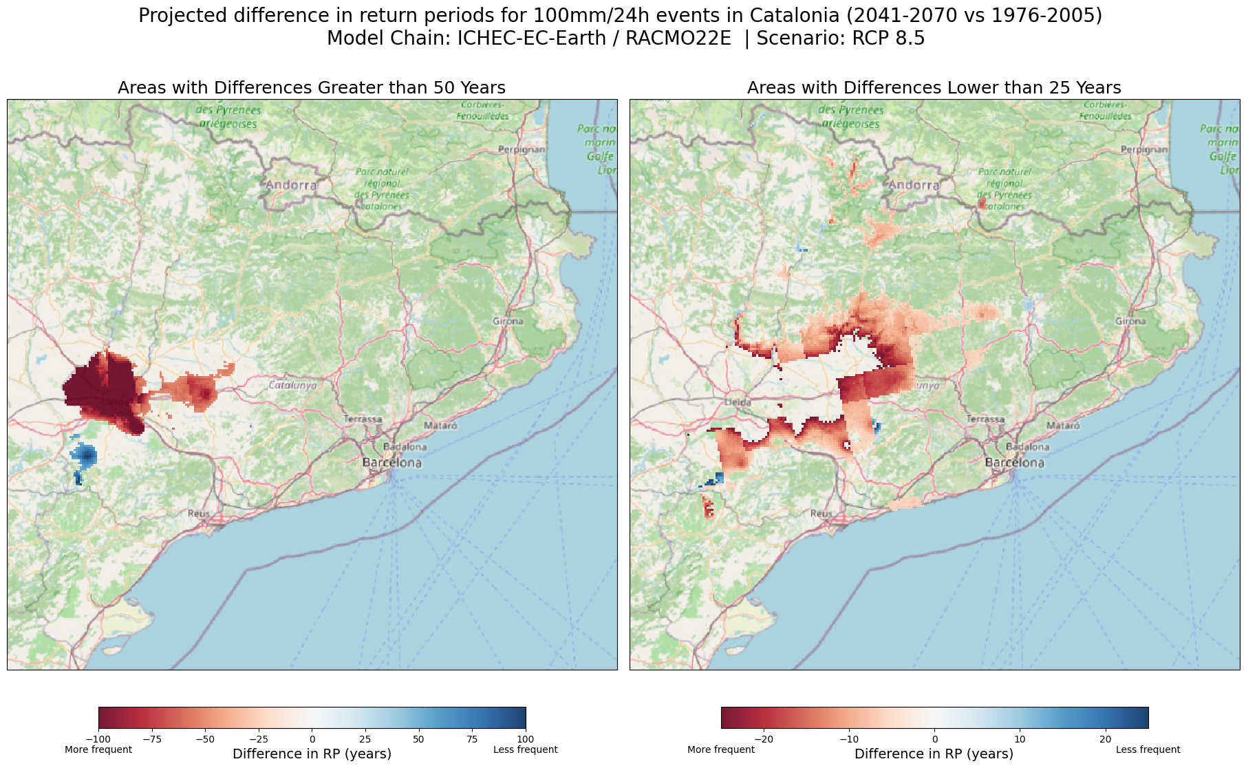
Explanation
Why are these maps useful? These maps highlight the areas with the most significant changes in frequency of events (return periods). By focusing on areas where changes are within out specific defined thresholds, these maps can help official authorities and planers pinpoint areas in the Catalonia region experiencing the most drastic shifts, thus, of greatest concern for future risk in the context of the RCP85 climate scenario.
6.4 Where in Catalonia will the frequency of 100 mm in 24 hours events increase and decrease? Regional Hotspots: Overlays and Transparency#
Using the maps the wave created until this point, we can zoom in on the specific areas in Catalonia that are showing the biggest changes in the frequency of 100 mm/24h events. These Regional Hotspots maps can help us take a closer look at areas where these events are expected to increase or decrease significantly.
By applying some transparency to the regional hotspot map, we can overlay it with relevant background information to further understand and identify elements at risk (e.g., population, infrastructure). For this we can use background maps such as Open Street Maps or one of the Vulnerability or Exposure datasets provided by the CLIMAAX project.
For this example, we have plotted the schools and hospitals within our zoomed-in area. Feel free to explore the different elements you can plot and modify the section of the code accordingly. You can also plot only the zoom-in area withou any elements
# Path of rasters to plot.
path_rp_current = os.path.join(results_dir, 'RP_CAT_threshold_100mm.tiff')
path_rp_future = glob.glob(os.path.join(results_dir, 'RP_shift*.tiff'))[0]

# Coordinates for bounding box
West, South, East, North = 0.29282, 41.495136, 0.84969, 41.836757
transformer = pyproj.Transformer.from_crs('epsg:4326', 'epsg:25831')
x_min, y_min, x_max, y_max = transformer.transform_bounds(South, West, North, East)

# Read data and calculate difference
current_data = rio.open_rasterio(path_rp_current, masked =True)
future_data = rio.open_rasterio(path_rp_future, masked =True)
diff_data = future_data - current_data
diff_data = diff_data.sel(y=slice(y_max, y_min), x=slice(x_min, x_max))
diff_data.values = np.where((diff_data > -50) & (diff_data < 50), np.nan, diff_data)

# Convert projection so matplotlib understands it.
proj_rp = ds_current.rio.crs
proj_rp = ccrs.epsg(proj_rp.to_epsg())

# Plot difference RP
fig, ax = plt.subplots(figsize=(17, 10))  # Increase figure size
im_diff = diff_data.plot(ax=ax, add_colorbar=False, cmap='RdBu', vmin=-100, vmax=100, alpha=0.75)
ctx.add_basemap(ax=ax, crs=diff_data.rio.crs.to_string(), source=ctx.providers.OpenStreetMap.Mapnik, attribution=False)

# Extract critical infrastucture data (hospitals and schools) from OSM
place_name = "Lleida, Spain"

hospitals = ox.features_from_place(place_name, tags={'amenity': 'hospital'})
hospitals_utm = hospitals.to_crs('EPSG:25831')
hospitals_utm['geometry'] = hospitals_utm.geometry.centroid

schools = ox.features_from_place(place_name, tags={'amenity': 'school'})
schools_utm = schools.to_crs('EPSG:25831')
schools_utm['geometry'] = schools_utm.geometry.centroid

# Plot critical infrastucture
schools_utm.plot(ax=ax, color='blue', marker='s', markersize=50, label='Schools')
hospitals_utm.plot(ax=ax, color='green', marker='s', markersize=50, label='Hospitals')

# Add legend to the map with the number of Schools and Hospitals
hospital_patch = mpatches.Patch(color='green', label=f'Hospitals: {len(hospitals)}')
school_patch = mpatches.Patch(color='blue', label=f'Schools: {len(schools)}')
plt.legend(handles=[hospital_patch, school_patch])

# Add colorbar
cb_diff = fig.colorbar(im_diff, ax = ax, location ='bottom', shrink = 0.5, pad=0.05)
cb_diff.set_label('Difference in Return Period (years)')
cb_diff.ax.text(1, -0.8, 'Less frequent', ha='center', va='top', transform=cb_diff.ax.transAxes)
cb_diff.ax.text(0, -0.8, 'More frequent', ha='center', va='top', transform=cb_diff.ax.transAxes)

# Add title
fig.suptitle(f'Projected difference in return periods for 100mm/24h events in Catalonia: 2041-2070 vs 1976-2005 \n Model Chain: ICHEC-EC-Earth / RACMO22E  | Scenario: RCP 8.5',fontsize = 16)
ax.set_title('Areas in Catalonia with Differences Greater than 50 Years', fontsize = 14)

# Remove axis ticks and labels
plt.tight_layout()
ax.set_xticks([])
ax.set_yticks([])
ax.set_xlabel('')
ax.set_ylabel('')

# Show and save plot
plt.show()
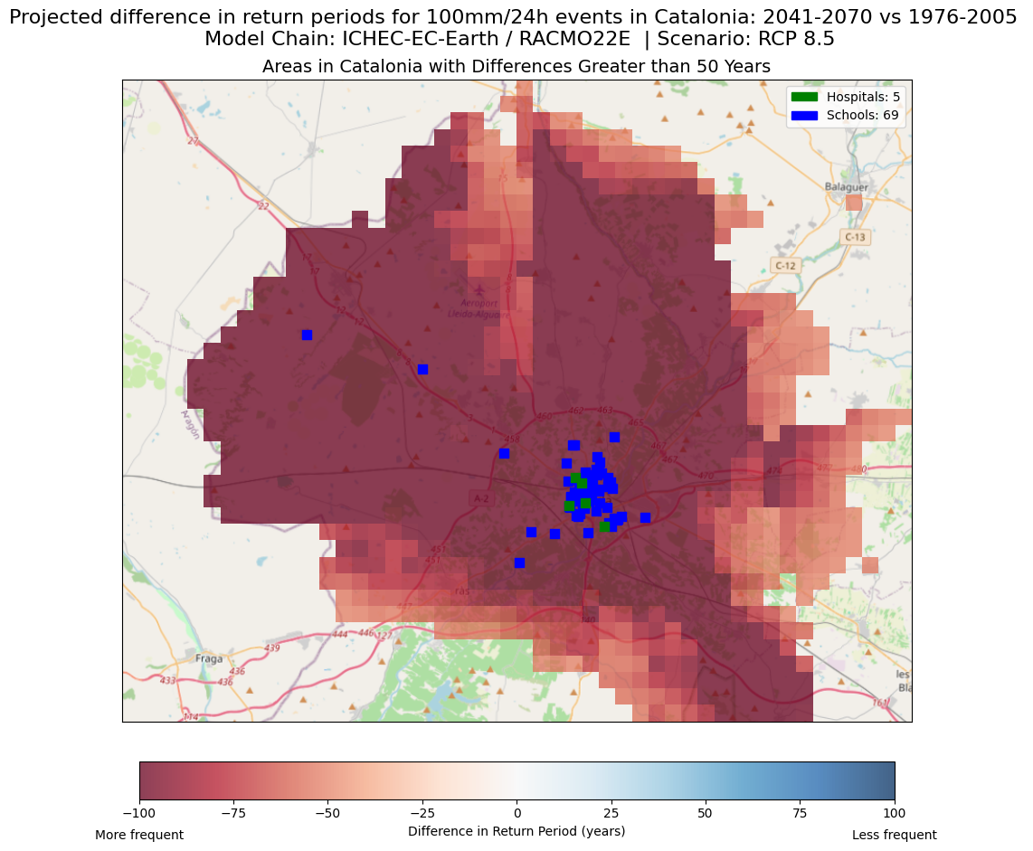
Explanation
How to interpret the maps: By combining these datasets, we can identify regions that will experience drastic frequency changes in extreme rainfall, but also the population or infrastructure that is exposed and can be particularly vulnerable to these events.
Why are these maps useful?
They help identify the critical infrastructure and population at high risk of suffering the negative consequences of the increased frequency of 100 mm / 24h events.
Authorities and planners can use this information to prioritise areas for intervention (e.g., improving drainage systems) while emergency response teams can identify sectors that may need more robust response plans or resources during extreme events.
Decision-makers and officials can use these maps as a base to develop and implement policies to address the increasing risk. For example, areas identified as high risk may require implementing strict planning laws or urgent investment in flood defences
Governments and organisations can identify the areas where funding and resources for climate resilience initiatives must be prioritised, helping ensure that efforts are directed where they are most needed.
By visualising the combined datasets, communities can understand their level of risk in the context of climate scenarios. This information can help to promote the planning and implementation of proactive steps to enhance their climate adaptation (e.g., designing community-based disaster preparedness plans)
Finally, local governments can exploit this information as a rational basis to implement small-scale projects to mitigate risks, such as green infrastructure and local emergency preparedness plans
6.5 Will the magnitude of 100 mm in 24 hours events increase or decrease in the near-future in Catalonia? Visualising the Shift in Precipitation#
To understand how the magnitude of 100 mm/24h rainfall events will change in the near future across Catalonia, we can use a similar approach to the difference map we created for the return period shifts. This will help us identify where extreme rainfall events are expected to become more intense or less intense in the future.
# Path of rasters to plot.
path_prec_shift = os.path.join(results_dir, f"PREC_factor_threshold_{INTENSITY_TH}mm_{DURATION_TH}h_{GCM}_{RCM}_{RCP}_{TIME_FRAMES['historical']}_{TIME_FRAMES[RCP]}.tiff")

# Read data and calculate precentatge
ds_prec_shift = rio.open_rasterio(path_prec_shift, masked =True)
ds_prec_shift = (ds_prec_shift-1)*100

# Convert projection so matplotlib understands it.
proj_prec = ds_prec_shift.rio.crs
proj_prec = ccrs.epsg(proj_prec.to_epsg())

# Plot difference RP
fig, ax = plt.subplots(figsize = (17,10), subplot_kw = {'projection': proj_prec}, layout = 'constrained')
im_prec_shift = ds_prec_shift.plot(ax = ax, add_colorbar=False,cmap='RdBu_r', vmin=-50, vmax=50, alpha = 0.9)
ctx.add_basemap(ax=ax, crs=proj_prec, source=ctx.providers.OpenStreetMap.Mapnik, attribution = False)

# Add colorbar
cb_prec_shift = fig.colorbar(im_prec_shift, ax = ax, location ='bottom', shrink = 0.5 )
cb_prec_shift.set_label('Precipitation shift (%)')
cb_prec_shift.ax.text(0, -1, 'Less intense', ha='center', va='top', transform=cb_prec_shift.ax.transAxes)
cb_prec_shift.ax.text(1, -1, 'More intense', ha='center', va='top', transform=cb_prec_shift.ax.transAxes)

# Add title
ax.set_title('Model Chain: ICHEC-EC-Earth / RACMO22E  | Scenario: RCP 8.5')
fig.suptitle('Shift in Precipitation Percentage for 100mm/24h events in Catalonia: 2041-2070 vs 1976-2005',fontsize = 16)

# Show and save plot
plt.show()
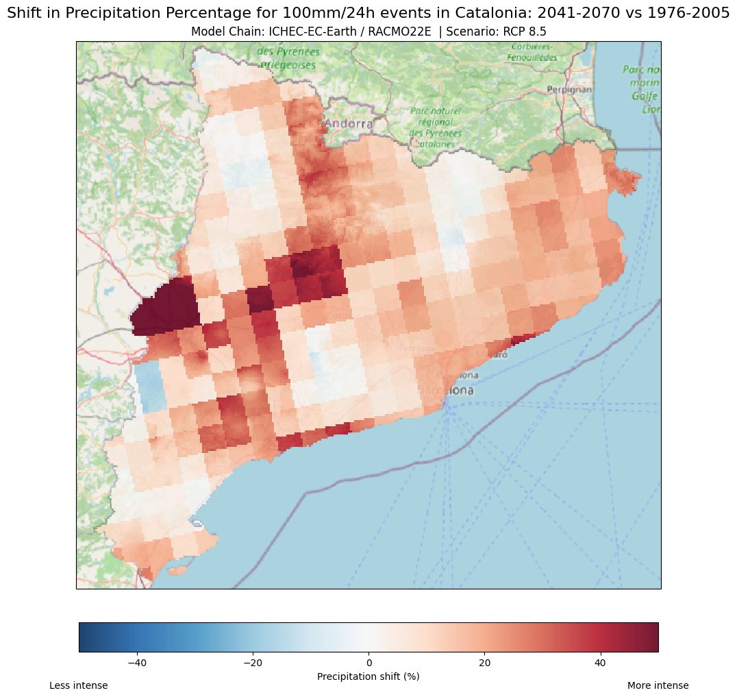
Explanation
Maps Description: The above difference map compares the rainfall magnitude shift for a 100mm/24h event between the current period and the future projection (2041-2070) under the RCP 8.5 scenario. It shows where rainfall events are expected to become more or less intense in the future.
Colour Palette: The colours represent how much the rainfall magnitude (100 mm) in 24 hours is projected to change between the current and future scenarios.
Red areas: These show where the rainfall magnitude (100mm in 24 hours) is projected to increase. This means that for the same 24-hour event and current frequency, more rain is expected in the future.
Blue areas: In contrast, these indicate a decrease in the rainfall magnitude.
White/neutral colours: Areas where little or no change is expected (difference close to zero)
Visualisation scale: The scale has been set from –50 to +50 %. For this particular example, this scale makes it easier to identify and focus on the areas where the rainfall (magnitude) changes drastically. For example:
If an area’s (pixel) rainfall magnitude decreases from 150 mm (1976-2005) to 50 mm (2041-2070), this is a 66% decrease, shown as dark blue.
However, If a pixel’s rainfall magnitude increases from 50 mm to 90 mm, this would be a 80% increase. Therefore, the colour assigned to this pixel would be dark red.
Why are these maps useful?
Help local authorities, planners and decision-makers to quickly identify where extreme precipitation events (red zones), such as the ones associated with a critical threshold of 100 mm/24 hours, are likely to become more severe. This allows decision-makers to quickly assess risk levels across different regions.
This information can help to prioritise areas for urban flood mitigation actions or infrastructure improvements (e.g. drainage systems). In contrast, the above map can also identify areas where immediate action and adaptation might not be as urgent (blue zones).
Creating Magnitude Shift Visualisations
You can use the same approach and code for highlighting magnitude shift visualisations as we did for the frequency shift maps. The process is identical, except you’ll be using rainfall magnitude data instead of return period data.
Just make sure to adjust parameters such as the color scale (
vminandvmax) and aux.values to suit the range of changes in magnitudeRed areas will indicate increases in rainfall magnitude (100 mm in 24 hours), while blue areas will indicate decreases. By following the same steps and modifying these values, you’ll be able to generate clear visualizations showing where rainfall intensity is projected to increase or decrease across your region.
Step 7: Different scenarios and experiment chains - Visualisation examples#
An ensemble model simulation can consist of different chains of GCM/RCM but only one RCP scenario (multi-model-ensemble) or one model and different RCP scenarios (multi-scenario-ensemble). Analysing ensemble members’ mean and standard deviation is the simplest method to estimate uncertainty, but other methods exist. For illustration purposes (100 mm/24 threshold), we have pre-calculated the datasets needed for this example using this workflow’s Hazard and Risk notebook.
The additional pre-calculated datasets are:
| Attribute | RCP 4.5 | RCP 8.5 |
|---|---|---|
| Global and Regional Climate Model Chains (2041-2070) |
ichec-ec-earth/knmi-racmo22e |
ichec-ec-earth/knmi-racmo22e mohc-hadgem2-es/knmi-racmo22e mpi-m-mpi-esm-lr/smhi-rca4 |
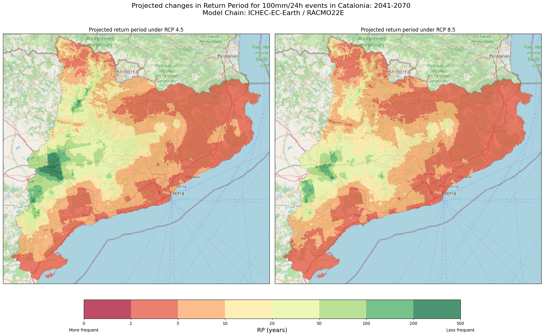
7.1 One Global/Regional climate chain and different RCPs (Multi-Scenario Ensemble)#
If we have the magnitude and frequency shift maps for both RCP 8.5 and RCP 4.5 for the same period (2041-2070) from the same global/regional climate chain, we can create visualisations to compare these two different climate scenarios. These visualisations can help us understand how different emissions pathways could shape our future if significant action on climate change isn’t taken soon.
To start, we’ll create side-by-side maps that show the expected future return periods for a 100mm/24h rainfall event across Catalonia, comparing the outcomes under both RCP 4.5 (a more moderate emissions scenario) and RCP 8.5 (a higher-emission scenario).
Tip
Please keep in mind that the RCP 4.5 maps and the datasets for other combinations have been prepared beforehand using the Hazard and Risk notebook of this workflow.
# Path of rasters to plot.
path_rp45 = precip_data_pooch.fetch('risk_assessment/RP_shift_threshold_100mm_24h_ichec-ec-earth_knmi-racmo22e_rcp45_1976-2005_2041-2070.tiff')
path_rp85 = precip_data_pooch.fetch('risk_assessment/RP_shift_threshold_100mm_24h_ichec-ec-earth_knmi-racmo22e_rcp85_1976-2005_2041-2070.tiff')

# Read data
ds_45 = rio.open_rasterio(path_rp45, masked =True)
ds_85 = rio.open_rasterio(path_rp85, masked =True)

# Convert projection so matplotlib understands it.
proj_rp = ds_45.rio.crs
proj_rp = ccrs.epsg(proj_rp.to_epsg())

# Define colorbar.
cmap_ret_per = plt.get_cmap("RdYlGn")
bounds_ret_per = [0, 2, 5, 10, 20, 50, 100, 200, 500]
norm_ret_per = mpl.colors.BoundaryNorm(bounds_ret_per, cmap_ret_per.N)

# Initialize Figure
fig_rp, ax_rp = plt.subplots(1,2, figsize = (18,11), subplot_kw = {'projection': proj_rp}, layout = 'constrained')

# Plot RP 4.5
im_45 = ds_45.plot(ax = ax_rp[0], add_colorbar=False, norm = norm_ret_per, cmap=cmap_ret_per, alpha = 0.7)
ctx.add_basemap(ax=ax_rp[0], crs=proj_rp, source=ctx.providers.OpenStreetMap.Mapnik, attribution = False)
ax_rp[0].set_title('Projected return period under RCP 4.5')

# Plot RP 8.5
im_85 = ds_85.plot(ax = ax_rp[1], add_colorbar=False, norm = norm_ret_per, cmap=cmap_ret_per, alpha = 0.7)
ctx.add_basemap(ax=ax_rp[1], crs=proj_rp, source=ctx.providers.OpenStreetMap.Mapnik, attribution = False)
ax_rp[1].set_title('Projected return period under RCP 8.5')

# Add colorbar
cb_rp = fig_rp.colorbar(im_85, ax = ax_rp[:], ticks=bounds_ret_per, location='bottom', shrink = 0.7)
cb_rp.set_label('RP (years)', fontsize = 14)
cb_rp.ax.text(0, -0.5, 'More frequent', ha='center', va='top', transform=cb_rp.ax.transAxes)
cb_rp.ax.text(1, -0.5, 'Less frequent', ha='center', va='top', transform=cb_rp.ax.transAxes)

# Add title
fig_rp.suptitle(f'Projected changes in Return Period for 100mm/24h events in Catalonia: 2041-2070 \n Model Chain: ICHEC-EC-Earth / RACMO22E',fontsize = 16)

# Show and save plot
plt.show()
Now that we’ve created side-by-side maps for RCP 4.5 and RCP 8.5, we can generate a difference map for the frequency. This map will highlight the differences between these two scenarios, making it easier to see how much more frequent 100 mm/24h are expected to become under the high-emission scenario RCP 8.5 compared to the moderate-emission scenario RCP 4.5.
# Path of rasters to plot.
path_rp45 = precip_data_pooch.fetch('risk_assessment/RP_shift_threshold_100mm_24h_ichec-ec-earth_knmi-racmo22e_rcp45_1976-2005_2041-2070.tiff')
path_rp85 = precip_data_pooch.fetch('risk_assessment/RP_shift_threshold_100mm_24h_ichec-ec-earth_knmi-racmo22e_rcp85_1976-2005_2041-2070.tiff')

# Read data and calculate difference
ds_45 = rio.open_rasterio(path_rp45, masked =True)
ds_85 = rio.open_rasterio(path_rp85, masked =True)
ds_diff =  ds_85 - ds_45

# Convert projection so matplotlib understands it.
proj_prec = ds_diff.rio.crs
proj_prec = ccrs.epsg(proj_prec.to_epsg())

# Plot difference RP
fig, ax = plt.subplots(figsize = (17,10), subplot_kw = {'projection': proj_prec}, layout = 'constrained')
im_diff = ds_diff.plot(ax = ax, add_colorbar=False,cmap='RdBu', vmin=-100, vmax=100, alpha = 0.9)
ctx.add_basemap(ax=ax, crs=proj_prec, source=ctx.providers.OpenStreetMap.Mapnik, attribution = False)

# Add colorbar
cb_diff = fig.colorbar(im_diff, ax = ax, location ='bottom', shrink = 0.5 )
cb_diff.set_label('Difference in Return Period (years)')
cb_diff.ax.text(0, -1, 'More frequent', ha='center', va='top', transform=cb_diff.ax.transAxes)
cb_diff.ax.text(1, -1, 'Less frequent', ha='center', va='top', transform=cb_diff.ax.transAxes)

# Add title
ax.set_title('Model Chain: ICHEC-EC-Earth / RACMO22E')
fig.suptitle('Shift in Return Periods for 100mm/24h Events: RCP 4.5 vs RCP 8.5 (2041-2070)',fontsize = 16)

# Show and save plot
plt.show()
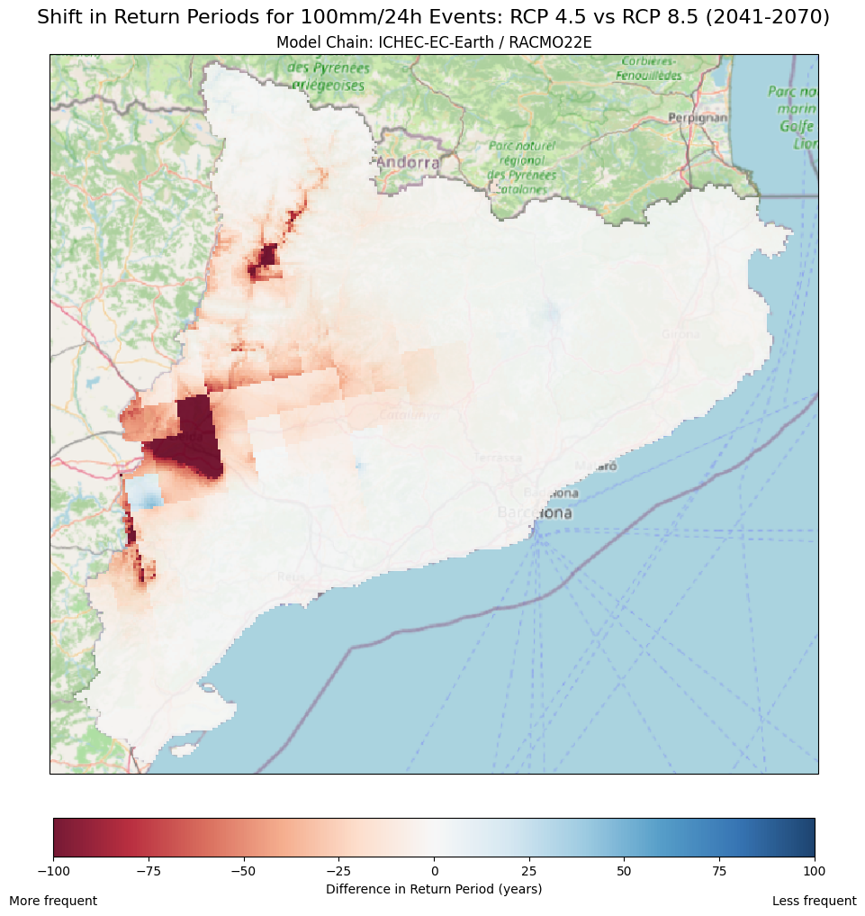
Explanation
Maps Description: The difference map compares the return periods for a 100mm/24h rainfall event between the RCP 8.5 (high-emissions) and the RCP 4.5 (low-emissions).
Colour Palette: The colours represent how much the return period changes between RCP 8.5 and the RCP 4.5.
Red areas: These indicate decreases in the return period, meaning that 100mm/24 events are expected to occur more frequently under the context of RCP 8.5 than RCP 4.5
Blue areas: In contrast, these indicate an increase in the return period meaning that 100mm/24h events will become less frequent in RCP 8.5 compared to RCP 4.5
White/neutral colours: Areas where little or no change is expected (difference close to zero) between these two scenarios.
Visualisation scale: The scale has been set from -100 to +100 years. For example:
A decrease from 150 years to 50 years between RCP 4.5 and RCP 8.5 will show up as dark red, representing a -100 year change.
However, an increase from 50 years to 175 years would appear as dark blue, showing a 100 year change.
How to interpret the maps?: In the context of Catalonia, under the RCP 4.5 and RCP 8.5 scenario:
Regions in Red: These areas indicate that the RCP 8.5 scenario is projected to result in more frequent extreme rainfall events (higher frequency differences) than compared to RCP 4.5. These regions may face higher risks of flooding and storm damage in a high-emissions scenario.
Regions in Blue: These areas are projected to experience 100 mm in 24 hours events less often in RCP 8.5 than in RCP 4.5, implying that the risk may decrease under this particular climate scenario.
Why are these maps useful? This map can help local authorities, planners and decision-makers to quickly identify where extreme precipitation events (red zones), such as the ones associated with a 100 mm/24 hours, are likely to become more frequent from RCP 4.5 and RCP 8.5 . This information can help to prioritise areas for urban flood mitigation actions or infrastructure improvements (e.g. drainage systems). In contrast, the above map can also identify areas where immediate action and adaptation might not be as urgent (blue zones).
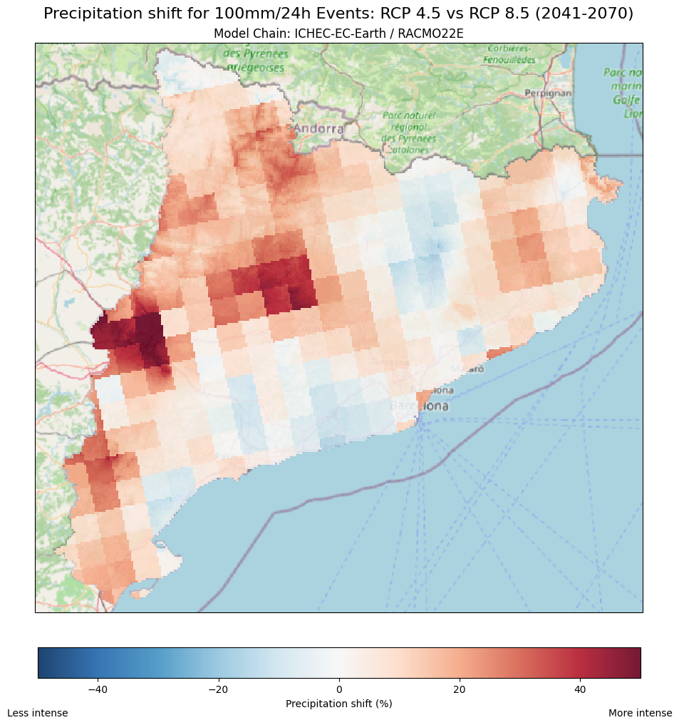
Finally, to visualise how the magnitude of 100 mm/24h rainfall events changes from RCP 4.5 to RCP 8.5, we can use a similar approach to the difference map we created for the return period shifts. This will help us identify where extreme rainfall events are expected to become more intense or less intense as we move from the moderate emissions scenario (RCP 4.5) to the high emissions scenario (RCP 8.5).
The interpretation of this map follows the same logic as the one for frequency explained in the previous section. Red areas indicate an increase in rainfall intensity, while blue areas show a decrease in intensity between the two emission scenarios.
# Path of rasters to plot.
path_prec45 = precip_data_pooch.fetch('risk_assessment/PREC_factor_threshold_100mm_24h_ichec-ec-earth_knmi-racmo22e_rcp45_1976-2005_2041-2070.tiff')
path_prec85 = precip_data_pooch.fetch('risk_assessment/PREC_factor_threshold_100mm_24h_ichec-ec-earth_knmi-racmo22e_rcp85_1976-2005_2041-2070.tiff')

# Read data and calculate percentatge
ds_45 = rio.open_rasterio(path_prec45, masked =True)
ds_85 = rio.open_rasterio(path_prec85, masked =True)
ds_perc = (ds_85 - ds_45)*100

# Convert projection so matplotlib understands it.
proj_prec = ds_perc.rio.crs
proj_prec = ccrs.epsg(proj_prec.to_epsg())

# Plot difference RP
fig, ax = plt.subplots(figsize = (17,10), subplot_kw = {'projection': proj_prec}, layout = 'constrained')
im_perc = ds_perc.plot(ax = ax, add_colorbar=False,cmap='RdBu_r', vmin=-50, vmax=50, alpha = 0.9)
ctx.add_basemap(ax=ax, crs=proj_prec, source=ctx.providers.OpenStreetMap.Mapnik, attribution = False)

# Add colorbar
cb_perc = fig.colorbar(im_perc, ax = ax, location ='bottom', shrink = 0.5 )
cb_perc.set_label('Precipitation shift (%)')
cb_perc.ax.text(1, -1, 'More intense', ha='center', va='top', transform=cb_perc.ax.transAxes)
cb_perc.ax.text(0, -1, 'Less intense', ha='center', va='top', transform=cb_perc.ax.transAxes)

# Add title
ax.set_title('Model Chain: ICHEC-EC-Earth / RACMO22E')
fig.suptitle('Precipitation shift for 100mm/24h Events: RCP 4.5 vs RCP 8.5 (2041-2070)',fontsize = 16)

# Show and save plot
plt.show()
7.2 One RCP and different Global/Regional climate chains (multi-model ensemble)#
On the other hand, using multiple models together, known as a multi-model ensemble, helps account for uncertainties in predicting future climate conditions. Since each climate model is built using different methods and assumptions, the results can vary even when looking at the same RCP scenario. By comparing the results from several models, we can get a clearer picture of potential future outcomes and see where models agree or disagree, giving us a better understanding of the range of possibilities and where uncertainties can lie.
Use the code below to generate a map showing the ensemble mean of three different Global/Regional combinations for RCP 8.5.
Tip
Please keep in mind that the two additional G/R maps have been prepared beforehand
# Path of rasters to plot.
path_rp_current = os.path.join(results_dir, 'RP_CAT_threshold_100mm.tiff')
path_model1 = precip_data_pooch.fetch('risk_assessment/RP_shift_threshold_100mm_24h_mohc-hadgem2-es_knmi-racmo22e_rcp85_1976-2005_2041-2070.tiff')
path_model2 = precip_data_pooch.fetch('risk_assessment/RP_shift_threshold_100mm_24h_ichec-ec-earth_knmi-racmo22e_rcp85_1976-2005_2041-2070.tiff')
path_model3 = precip_data_pooch.fetch('risk_assessment/RP_shift_threshold_100mm_24h_mpi-m-mpi-esm-lr_smhi-rca4_rcp85_1976-2005_2041-2070.tiff')

# Read data
ds_current = rio.open_rasterio(path_rp_current, masked =True)
ds_model1 = rio.open_rasterio(path_model1, masked =True)
ds_model2 = rio.open_rasterio(path_model2, masked =True)
ds_model3 = rio.open_rasterio(path_model3, masked =True)

# Calculate the mean and the difference
future_data = (ds_model1 + ds_model2 + ds_model3)/3
diff_data = future_data - ds_current

# Convert projection so matplotlib understands it.
proj_rp = ds_current.rio.crs
proj_rp = ccrs.epsg(proj_rp.to_epsg())

# Define colorbar.
cmap_ret_per = plt.get_cmap("RdYlGn")
bounds_ret_per = [0, 2, 5, 10, 20, 50, 100, 200, 500]
norm_ret_per = mpl.colors.BoundaryNorm(bounds_ret_per, cmap_ret_per.N)

# Initialize Figure
fig_diff, ax_diff = plt.subplots(1,2, figsize = (18,11), subplot_kw = {'projection': proj_rp}, layout = 'constrained')

# Plot future RP
im_future = future_data.plot(ax = ax_diff[0], add_colorbar=False, norm = norm_ret_per, cmap=cmap_ret_per, alpha = 0.7)
ctx.add_basemap(ax=ax_diff[0], crs=proj_rp, source=ctx.providers.OpenStreetMap.Mapnik, attribution = False)
ax_diff[0].set_title('Changes in Return Periods for 2041-2070',fontsize = 18)
cb_future = fig_diff.colorbar(im_future, ax = ax_diff[0], location='bottom', shrink = 0.7)
cb_future.set_label('RP (years)', fontsize = 14)
cb_future.ax.text(1, -0.8, 'Less frequent', ha='center', va='top', transform=cb_future.ax.transAxes)
cb_future.ax.text(0, -0.8, 'More frequent', ha='center', va='top', transform=cb_future.ax.transAxes)

# Plot future RP
im_diff = diff_data.plot(ax = ax_diff[1], add_colorbar=False,cmap='RdBu', vmin=-100, vmax=100, alpha = 0.9)
ctx.add_basemap(ax=ax_diff[1], crs=proj_rp, source=ctx.providers.OpenStreetMap.Mapnik, attribution = False)
ax_diff[1].set_title('Differences in Return Periods: 2041-2070 vs 1976-2005',fontsize = 18)
cb_diff = fig_diff.colorbar(im_diff, ax = ax_diff[1], location='bottom', shrink = 0.7)
cb_diff.set_label('Difference in RP (years)', fontsize = 14)
cb_diff.ax.text(1, -0.8, 'Less frequent', ha='center', va='top', transform=cb_diff.ax.transAxes)
cb_diff.ax.text(0, -0.8, 'More frequent', ha='center', va='top', transform=cb_diff.ax.transAxes)

# Add title
fig_diff.suptitle(f'Projected return periods for 100mm/24h events in Catalonia \n  Ensamble mean* | Scenario: RCP 8.5',fontsize = 20)
cb_future.ax.text(0.3, -2.7, '*ichec-ec-earth/RACMO22E | mohc-hadgem2-es/RACMO22E | mpi-m-mpi-esm-lr/SMHI-RCA4', ha='center', va='top', transform=cb_future.ax.transAxes)
# Show and save plot
plt.show()
We can do the same for the magnitude shifts. By also calculating the standard deviation, we can visualise how much the model projections vary for RCP 8.5 in the context of extreme rainfall. This can help us identify areas where the models disagree the most and provide a clearer picture of where the predictions are less certain.
# Path of rasters to plot.
path_model1 = precip_data_pooch.fetch('risk_assessment/PREC_factor_threshold_100mm_24h_mohc-hadgem2-es_knmi-racmo22e_rcp85_1976-2005_2041-2070.tiff')
path_model2 = precip_data_pooch.fetch('risk_assessment/PREC_factor_threshold_100mm_24h_ichec-ec-earth_knmi-racmo22e_rcp85_1976-2005_2041-2070.tiff')
path_model3 = precip_data_pooch.fetch('risk_assessment/PREC_factor_threshold_100mm_24h_mpi-m-mpi-esm-lr_smhi-rca4_rcp85_1976-2005_2041-2070.tiff')

# Read data
ds_model1 = rio.open_rasterio(path_model1, masked =True)
ds_model2 = rio.open_rasterio(path_model2, masked =True)
ds_model3 = rio.open_rasterio(path_model3, masked =True)

# Calculate the mean and the STD
ds_mean = (ds_model1 + ds_model2 + ds_model3)/3
ds_rel = (ds_mean-1)*100
std_ds = np.sqrt(((ds_model1 - ds_mean) ** 2 + (ds_model2 - ds_mean) ** 2 + (ds_model3 - ds_mean) ** 2) / 3)

# Convert projection so matplotlib understands it.
proj_mean = ds_rel.rio.crs
proj_mean = ccrs.epsg(proj_mean.to_epsg())

# Initialize Figure
fig_mean, ax_mean = plt.subplots(1,2, figsize = (18,11), subplot_kw = {'projection': proj_mean}, layout = 'constrained')

# Plot future mean
im_rel = ds_rel.plot(ax = ax_mean[0], add_colorbar=False,cmap='RdBu_r', vmin=-50, vmax=50, alpha = 0.9)
ctx.add_basemap(ax=ax_mean[0], crs=proj_mean, source=ctx.providers.OpenStreetMap.Mapnik, attribution = False)
ax_mean[0].set_title('Precipitation shift',fontsize = 18)
cb_mean = fig_mean.colorbar(im_rel, ax = ax_mean[0], location='bottom', shrink = 0.7)
cb_mean.set_label('Precipitation shift (%)', fontsize = 14)
cb_mean.ax.text(1, -0.8, 'More intense', ha='center', va='top', transform=cb_mean.ax.transAxes)
cb_mean.ax.text(0, -0.8, 'Less intense', ha='center', va='top', transform=cb_mean.ax.transAxes)

# Plot future RP
im_std = std_ds.plot(ax = ax_mean[1], add_colorbar=False,cmap='YlOrRd', vmin=0, vmax=1, alpha = 0.9)
ctx.add_basemap(ax=ax_mean[1], crs=proj_mean, source=ctx.providers.OpenStreetMap.Mapnik, attribution = False)
ax_mean[1].set_title('Standard Deviation',fontsize = 18)
cb_std = fig_mean.colorbar(im_std, ax = ax_mean[1], location='bottom', shrink = 0.7)
cb_std.set_label('Standard Deviation', fontsize = 14)

# Add title
fig_mean.suptitle(f'Projected precipitation shifts for 100mm/24h events in Catalonia: 1976-2005 vs 2041-2070 \n  Ensamble mean* | Scenario: RCP 8.5',fontsize = 20)
cb_mean.ax.text(0.3, -2.7, '*ichec-ec-earth/RACMO22E | mohc-hadgem2-es/RACMO22E | mpi-m-mpi-esm-lr/SMHI-RCA4', ha='center', va='top', transform=cb_mean.ax.transAxes)

# Show and save plot
plt.show()
Explanation
Why are these maps useful? Averaging the results from multiple climate models helps give a better overall picture of how extreme precipitation might change in the future based on climate projections. Instead of relying on just one model, combining results can help us reduce uncertainty and provide a more reliable projection. :::
Step 8: Where in Catalonia should we focus our adaptation measures? Identifying High-Priority action zones across the region#
Now that we’ve mapped both how often (frequency) and how much harder (magnitude change) 100 mm/24 h events will strike Catalonia, it’s time to pull it all together. In this final step, we’ll create an action-priority map for authorities and municipalities. We will use a simple colour scale to easily identify municipalities that require urgent attention (those expected to experience these events frequently) and those where extreme rainfall events, based on our critical threshold, are expected to remain relatively rare. We will also overlay hatching patterns to showcase where 100 in 24 hours will be experienced, especially hard (magnitude changes).
With this layout, you will instantly see where these events will come often (color) and hit harder (hatch)
8.1 Calculate Municipality averages#
First, let’s pull together the results so each municipality has its own summary of how often 100 mm in 24 hours events will occur and how much harder they’ll hit:
path_rp_th = os.path.join(results_dir, 'RP_CAT_threshold_100mm.tiff')
ds_rp_th = rio.open_rasterio(path_rp_th)

# Access projection and data values
proj_rp_th = ds_rp_th.rio.crs
transform_rp_rh = ds_rp_th.rio.transform()
nvar, ny, nx = ds_rp_th.shape
data = ds_rp_th.values

# Read data and calculate difference
# Paths to the reference and future period rasters
gdf = gpd.read_file(precip_data_pooch.fetch('risk_assessment/divisions-administratives-v2r1-comarques-5000-20240705.zip'))

# Path of rasters to RP shift.
path_rp_current = os.path.join(results_dir, 'RP_CAT_threshold_100mm.tiff')
path_model1 = precip_data_pooch.fetch('risk_assessment/RP_shift_threshold_100mm_24h_mohc-hadgem2-es_knmi-racmo22e_rcp85_1976-2005_2041-2070.tiff')
path_model2 = precip_data_pooch.fetch('risk_assessment/RP_shift_threshold_100mm_24h_ichec-ec-earth_knmi-racmo22e_rcp85_1976-2005_2041-2070.tiff')
path_model3 = precip_data_pooch.fetch('risk_assessment/RP_shift_threshold_100mm_24h_mpi-m-mpi-esm-lr_smhi-rca4_rcp85_1976-2005_2041-2070.tiff')

# Read data
ds_current = rio.open_rasterio(path_rp_current, masked =True)
ds_model1 = rio.open_rasterio(path_model1, masked =True)
ds_model2 = rio.open_rasterio(path_model2, masked =True)
ds_model3 = rio.open_rasterio(path_model3, masked =True)

# Calculate the mean RP shift
future_rp = (ds_model1 + ds_model2 + ds_model3)/3
write_geotiff("RP_shift_threshold_100mm_24h_ensamble_rcp85_1976-2005_2041-2070.tiff", future_rp[0, :, :])
path_rp = os.path.join(results_dir, "RP_shift_threshold_100mm_24h_ensamble_rcp85_1976-2005_2041-2070.tiff")

# Path of rasters to PRECIPITATION factor
path_model1 = precip_data_pooch.fetch('risk_assessment/PREC_factor_threshold_100mm_24h_mohc-hadgem2-es_knmi-racmo22e_rcp85_1976-2005_2041-2070.tiff')
path_model2 = precip_data_pooch.fetch('risk_assessment/PREC_factor_threshold_100mm_24h_ichec-ec-earth_knmi-racmo22e_rcp85_1976-2005_2041-2070.tiff')
path_model3 = precip_data_pooch.fetch('risk_assessment/PREC_factor_threshold_100mm_24h_mpi-m-mpi-esm-lr_smhi-rca4_rcp85_1976-2005_2041-2070.tiff')

# Read data
ds_model1 = rio.open_rasterio(path_model1, masked =True)
ds_model2 = rio.open_rasterio(path_model2, masked =True)
ds_model3 = rio.open_rasterio(path_model3, masked =True)

# Calculate the mean PREC shift
ds_mean = (ds_model1 + ds_model2 + ds_model3) / 3
write_geotiff("PREC_factor_threshold_100mm_24h_ensamble_rcp85_1976-2005_2041-2070.tiff", ds_mean[0, :, :])
path_prec = os.path.join(results_dir, "PREC_factor_threshold_100mm_24h_ensamble_rcp85_1976-2005_2041-2070.tiff")

# Calculate zonal statistics for each raster (mean value in each region)
stats_rp = rasterstats.zonal_stats(gdf, path_rp, stats=['mean'], geojson_out=True)
stats_rp_current = rasterstats.zonal_stats(gdf, path_rp_current, stats=['mean'], geojson_out=True)
stats_prec = rasterstats.zonal_stats(gdf, path_prec, stats=['mean'], geojson_out=True)

# Extract mean values from stats
rp_mean = [stat['properties']['mean'] for stat in stats_rp]
rp_mean_current = [stat['properties']['mean'] for stat in stats_rp_current]
prec_diff = [stat['properties']['mean'] for stat in stats_prec]

# Add these values to your original GeoDataFrame (optional but useful)
gdf['rp_future'] = rp_mean
gdf['rp_current'] = rp_mean_current
gdf['prec_diff'] = prec_diff

gdf.to_file(os.path.join(results_dir, 'summary_comarques'))
8.2 Plot Your Action-Priority Map#
Now that each municipality carries its own rainfall‐frequency and intensity data, we can paint them on a map to quickly showcase “where to act first”:
from pyproj import CRS
rp_colors = ['#c20019', '#faab23', '#fff20c']
rp_bounds = [0, 5, 20, 1000]
rp_cmap = ListedColormap(rp_colors)
rp_norm = BoundaryNorm(rp_bounds, len(rp_colors))

# Hatch logic: denser patterns for higher precip change
def get_hatch(prec_val):
    if prec_val < 1.2:
        return None
    elif prec_val < 1.4:
        return '///'
    else:
        return 'xxx'

proj_rp = pyproj.CRS.from_epsg(32631)
gdf = gpd.read_file(os.path.join(results_dir, 'summary_comarques', 'summary_comarques.shp'))
fig, ax = plt.subplots(figsize=(17, 10), layout='constrained')

for _, row in gdf.iterrows():
    rp_val = row['rp_future']
    color = rp_cmap(rp_norm(rp_val))
    hatch = get_hatch(row['prec_diff'])
    row_gdf = gpd.GeoDataFrame([row], geometry='geometry', crs=gdf.crs)
    row_gdf.plot(
        ax=ax, facecolor=color, edgecolor='black', linewidth=1,
        hatch=hatch
    )

ctx.add_basemap(ax=ax, crs=proj_rp, source=ctx.providers.OpenStreetMap.Mapnik, attribution=False)
ax.set_axis_off()

fig.suptitle(
    "Which comarques need to act first against more frequent, more intense 100 mm/24 h rainfall events? RCP 8.5",
    fontsize=17, weight='bold'
)

sm = mpl.cm.ScalarMappable(norm=rp_norm, cmap=rp_cmap)
cbar = fig.colorbar(sm, ax=ax, orientation='horizontal', fraction=0.04, pad=0.02, aspect=30)
cbar.set_label('Return period (years)', fontsize=13)
cbar.set_ticks([0, 5, 20])
cbar.set_ticklabels(['<5', '5–20', '>20'])

legend_elements = [
    mpatches.Patch(facecolor='white', edgecolor='black', hatch=None, label='ΔP < 20%'),
    mpatches.Patch(facecolor='white', edgecolor='black', hatch='///', label='20% ≤ ΔP < 40%'),
    mpatches.Patch(facecolor='white', edgecolor='black', hatch='xxx', label='ΔP ≥ 40%')
]
ax.legend(handles=legend_elements, loc='lower right', title="Precip. Change",
          fontsize=11, title_fontsize=12, frameon=True, facecolor='white')

cbar.ax.text(0.5, -1.6,
             '*ichec-ec-earth/RACMO22E | mohc-hadgem2-es/RACMO22E | mpi-m-mpi-esm-lr/SMHI-RCA4',
             ha='center', va='top', transform=cbar.ax.transAxes, fontsize=9)

plt.show()
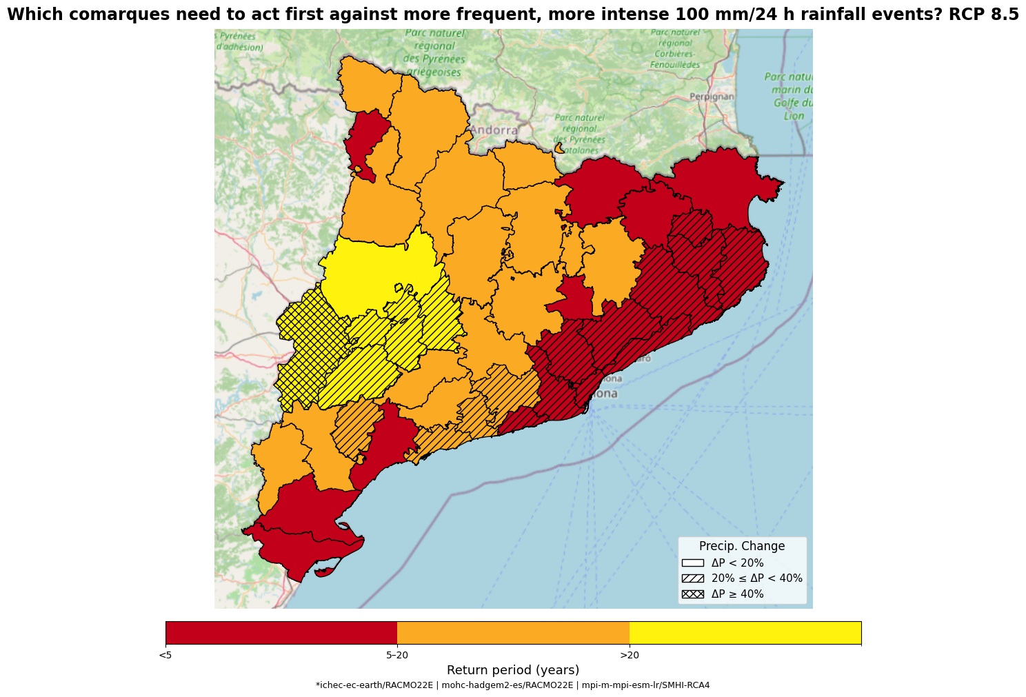
Explanation
Map description: Each comarca is shaded to indicate projected storm frequency—how often a 100 mm/24 h event will occur in 2041–2070 under RCP 8.5—and overlaid with hatching to signal storm magnitude increase relative to today (20% increase).
Colour Palette: The colours follow the familiar “traffic-light” intuition to call out action priorities based on return period bins:
Deep red: Events are expected with a high frequency (≤5 years)
Orange: Events expected with a moderate frequency (5 to 20 years)
Yellow: Events expected with a low frequency (above 20)
Hatching: Flags where 100 mm in 24-hour events will be more intense (magnitude jumps) in comparison to our baseline:
No hatch: The increase is below 20%
‘///’ hatch: The increase is between 20-40%
´xxx´ hatch: The increase is beyond 40%
Tip
The return period and magnitude bins should be adapted to your own tolerance levels by answering the questions “How often can I tolerate experiencing the impacts associated with a specific rainfall event (e.g., 100 mm in 24 hours?) and “How much change in magnitude can I tolerate?”
How to interpret the maps:
Regions in red - Urgent Attention: These rainfall events that cause intolerable impacts in our area are projected to be experience frequently—these zones must ramp up defenses, upgrade drainage, and sharpen emergency plans
Regions in Orange – Moderate urgency: These events and its impacts are expected to be experienced within the limits of what could be considered tolerable in terms of frequency
Regions in yellow ( >20 years) – Low priority: Storms will remain relatively rare but you should still keep an eye for changes in rainfall patterns
Hatching: Cross-hatches flag where rainfall event intensity is set to spike by at least 20 %, highlighting areas that could experience the heaviest impacts even if the storms aren’t frequent (Low frequency-high impact events).
Below 20% we can expect existing systems will generally be able to cope without challenges
Between 20-40% we can notice extra burden. Upgrades to drainage and emergency procedures are recommended
Above 40% is a sustainable intensification that could require full infrastructure reinforcement, new installations to be constructed together with regular drills.
Why are these maps useful? This dual‐encoding of frequency and intensity helps decision-makers quickly identify where to prioritize investments, update emergency plans, and engage local communities for resilience.Stakeholders, from engineers to elected officials, can all read the same map and immediately agree on next steps.
8.3 Quick-reference table of map combinations#
Use this table as a quick guide for interpreting your map at a glance – combining frequency (colour) and severity (hatching). Please keep in mind that the bin classification should be tailored to your own tolerable levels
Colour (Frequency) |
Hatch (Magnitude jump) |
Interpretation |
|---|---|---|
🔴 Red (< 5 yr) |
none (< 20 %) |
Storms of concern will arrive often, but with only minor extra rainfall. |
🔴 Red (< 5 yr) |
‘///’ (20–40 %) |
Storms will be both frequent and noticeably stronger than today. |
🔴 Red (< 5 yr) |
‘xxx’ (≥ 40 %) |
Most critical: storms will occur annually or more often and be vastly more intense. |
🟠 Orange (5–20 yr) |
none (< 20 %) |
Storms remain multi-year events, with limited intensification. |
🟠 Orange (5–20 yr) |
‘///’ (20–40 %) |
Less frequent but significantly stronger when they strike. |
🟠 Orange (5–20 yr) |
‘xxx’ (≥ 40 %) |
Uncommon yet sharply intensified storms—potential for surprise impacts |
🟡 Yellow (> 20 yr) |
none (< 20 %) |
Rare events with minimal change—baseline readiness is sufficient. |
🟡 Yellow (> 20 yr) |
‘///’ (20–40 %) |
Rare occurrences, but appreciably stronger—occasional stress on systems. |
🟡 Yellow (> 20 yr) |
‘xxx’ (≥ 40 %) |
Critical for adaptive planning: Infrequent but extreme when they occur—high-impact “low frequency” events. |
Example 2: More to come!#
Keep an eye on this section for new updates and examples